Sunday, January 31, 2010

The fast food hamburger of digital editing

Today I'm going to do the unspeakable: praise the Photoshop auto levels function.  This is something like a fine chef admitting to liking fast food.  Auto levels is notorious as the one click tool that gives mediocre results.  It's reliable, quick, easy, and not very good for you.  Sort of like a hamburger.  And yes, I have a use for it.  Not the usual use, though.

NativeForeigner is working on another Crimean War lithograph.  He asked me to check his progress, which was very good  except for something he hadn't noticed yet.  A problem loomed in the upper left corner.
Don't see it yet?  Neither did Native Foreigner.  And neither would I unless I had worked with this type of image before.  Now let's peek at what the auto levels function reveals: big stains!
A lot of nineteenth century lithographs have subtle problems with vertical banding that show up in the sky.  I suspect this is because they had been rolled for storage at some point.  This type of problem tends to seem very faint until the editor adjusts the histogram.  And then there's just no ignoring it.

If I suspect an image might have this type of problem I preview it in auto levels to gauge the severity.

And to all the other digital image editors who are gasping at this statement, please remember:
That's preview.
pre-view
p-r-e-v-i-e-w.

Please don't pounce on me like you're all chefs who've just caught a fellow chef munching French fries.
Using the History option we step back from that auto levels version.  It's too early to really change the histogram permanently.  That preview gave a very clear look at the side, shape, and darkness of the staining problem.  Now we're going to resolve the problem.  There are different ways to do this.  A lot of people like the Dodge and Burn tools.  I prefer masks and brightness adjustments.

The way I solve this is to draw a free form selection and add feathering.  Feathering a selection blends its borders.  This edit used 10 pixels of feathering and increased the brightness by 2 in the selected area.  If you like to be cautious you can do these edits within new layers.  Then redraw another selection, make a very slight adjustment, and keep going until the stains vanish.

Here's the effect of the first edit in another levels preview.  Once NativeForeigner understood this he did the remaining work himself.

Saturday, January 30, 2010

Library of Congress starts open source initiative

Considering how much of the historic media at Wikipedia comes from the Library of Congress, it may surprise you that the Wikimedia Foundation has no formal partnership with the Library of Congress. 

Yesterday Slashdot picked up on a Library of Congress initiative to do more of their work with open source software.  It would make a lot of sense if the Library of Congress interfaced directly with the world's most successful open source nonprofit: Wikimedia.  The Library of Congress has been absolutely wonderful about making its material available to the public at high resolution.  Today's post expresses appreciation for that openness in the hope that this valuable synergy will be appreciated and built upon.

Eight of the images that ran on the main page of the English Wikipedia this month came from the Library of Congress collection.  The image above is a landscape of Havana, Cuba painted in 1639 by Johannes Vingboons, which I restored.  Wikipedia's main page received 4.0 million page views while it ran at the Picture of the Day feature on January 1, 2010.  The image itself received 11,900 direct page views that day and a total of 13,382 direct views this month.  All of the page view statistics for Wikipedia's main page are confirmed here.
The Picture of the Day for January 6, 2010 was a seventeenth century chiaroscuro woodcut by Bartolommeo Coriolano, who was knighted by Pope Urban VII for his artistic work in engravings and woodcuts.  I did the restoration.  Wikipedia's main page received 5.1 million page views on January 6 and the image itself received 7937 direct page views this month.
This 1868 portrait of an Argentine gaucho was Picture of the Day on January 8.  Wikipedia's main page received 5.2 million page views that day and the image received 16,427 direct views this month.  This was another of my restorations.  We'll be seeing other volunteers' work too.
This 1890s photochrom print of the quays at Waterford, Ireland was restored by Jake Wartenberg.  It was Picture of the Day on January 14 when Wikipedia's main page received 5.3 million page views.  Jake's restoration has received 33,629 direct page views so far this month.  Good work, Jake!
The artist for this woodblock print of a women's bathhouse was Torii Kiyonaga, 1752-1815.  Wikipedian editor Torsodog performed the restoration.  It was Picture of the Day on January 18 when Wikipedia's main page received 5.6 million page views.  The image has received 39,158 direct page views this month.
 
On January 20 Wikipedia's main page ran this albumen print of Moroccan snake charmers, which was created during the latter half of the nineteenth century.  This was another of my restorations.  Wikipedia's main page received 5.3 million page views that day.  The image file has received 17,884 direct views this month.
On January 21 another one of Jake Wartenberg's restorations ran on Wikipedia's main page.  This is an 1856 lithograph of the hospital at Selimiye Barracks where Florence Nightingale worked during the Crimean War.  The main page had 5.3 million page views on January 21 and the image file received 21,840 direct views this month.
This theatrical advertisement from 1900 was restored by Adam Cuerden.  While it was Wikipedia's Picture of the Day for January 22, the site's main page received 5.3 million page views.  The image file hosting page has received 11,211 direct views this month.

Altogether that totals 41.1 million page views this month for Wikipedia's main page while media from the Library of Congress was running on it, and 161,468 direct page views for the eight Library of Congress images that were highlighted as Picture of the Day.  These numbers are typical for the attention the Library of Congress collection is receiving through Wikimedian volunteer efforts.

I'd like to coordinate directly with the Library of Congress management to utilize this synergy better.  And if the Library of Congress isn't interested I'll be happy to work more closely with institutions such as the Tropenmuseum that see the potential.

Friday, January 29, 2010

SMS Moltke

Staxringold asked me to collaborate with him on this restoration of the SMS Moltke at Hampton Roads, Virginia in 1912.  There was a difficult repair in the foreground on this image, which was 147 MB at full resolution in uncompressed TIFF format.  At preview size the area looks like two white marks in the waves about two-thirds of the way to the left.
This image was digitized from a glass plate negative.  Glass plate photography was developed in the mid-nineteenth century and was widely used until the early decades of the twentieth century when photographic film was introduced.
One of the problems with this format, though, is that the photographic emulsion is prone to damage.  Once damage occurs the emulsion can peel away from the glass.  That's starting to happen in this section.  The challenge I faced was to reconstruct the appearance of choppy water.  The sequence you'll see below was the progressive work on this area that I showed to Staxringold so he can do this type of area himself next time.  The following sections are screen shots at 200% resolution.
 
 
If it seems a little nutty to work at 200% resolution on a 147 MB digitization of a negative that was no larger than 5" x 7", maybe it is.  But glass plates are a high resolution format.  Film gained dominance in the consumer market because it was less fragile and easier to work with.  Glass plates remained in use for technical purposes such as astronomy and medical imaging until digital technologies took over at the very end of the twentieth century. 

All in all, that makes a pretty good useful lifespan for a technology that came into wide use during the American Civil War.

Thursday, January 28, 2010

D-Day

 
Occasionally digital restoration raises new questions.  This photograph depicts a synagogue in New York City on D-Day, 1944.  The Library of Congress didn't identify which congregation.  A Wikipedian who edits under the username Pharos has identified it as Congregation Emunath Israel on West Twenty-third Street.

I've requested this to be Wikipedia's picture of the day for June 6, 2010.

It would be really wonderful to make contact with this congregation before that day so they know about it.  A few of their older members might even be able to name who these women are.  Unfortunately they don't have a website or publish an email address.  Their telephone goes directly into a voice mail system.

So if you live in New York City or know a friend who does, would you be willing to help contact this congregation please?  I'd really appreciate the help.

Wednesday, January 27, 2010

This stinks in Cologne


The fourth largest city in Germany actually is quite beautiful.  The photograph here was taken by a German Wikimedian named Thomas Wolf and it is featured in three languages.  The thing that stinks is that the city's archive building collapsed last year; Cologne's archive had been one of the very few that had survived World War II completely intact.  Last March the city was constructing a subway on the same street.  Then suddenly the archive tumbled.

Two people died.  Thousands of documents going back nearly 1100 years were in rubble.  Half a million photographs were housed there.  Disasters such as the Cologne archive collapse demonstrate why it is important to digitize cultural records. Digital versions help protect and preserve a heritage.

So with thoughts of Cologne, here's a photochrom print circa 1910 of the Eisenbahn Bridge at Cologne from the Library of Congress collection.  I haven't restored it yet; maybe someday.


Tuesday, January 26, 2010

Looking ahead


Congratulations to Coffee on his first digitally restored featured picture: a nineteenth century whiskey advertisement so politically incorrect it's almost quaint.  It really is wonderful and rewarding to help new people such as NativeForeigner and Coffee learn digital restoration.  Yet tutoring is very time consuming.

So today's post is brief: it's time to scale up this digital restoration work.  One way to do that is to collaborate with art schools.  What I'd like to do is get this incorporated into the curricula of advanced digital editing classes with the best student work to be selected for exhibition in museums.  We have the contacts on the museum side to make that happen.

If you have contacts with an art school, please put them in touch with me: nadezhda(dot)durova(at)gmail(dot)com

Monday, January 25, 2010

Beginner's luck


Would you believe that this image is not only an editor's first restoration, but his first digital editing project of any sort?  NativeForeigner asked me to help choose his first project a few days ago.  After discussing several options I pointed him to a series of lithographs about the Crimean War.  The Library of Congress owns a wonderful set created by William Simpson in the mid-1850s that's been well preserved.  He installed GIMP and Skype, we traded screen shots and shared ideas, and he performed most of the edits himself.  Here's a view of the unedited original.

NativeForeigner inspired me to think of this when he showed an interest in Roger Fenton's Crimean War photography.  The Simpson lithographs make wonderful beginner projects.

So today we'll share a few highlights from the collaboration.  NativeForeigner's first question was how to address the area in this screen shot.

How many of these marks are intentional, he wondered?  I sent back a draft edit of a suggested first pass to the section.  The key concept here is that it's easier to take away than to readd data.  So when something is uncertain, leave it for later and work on the easier material while you grow more familiar with the image and gain an understanding of its context.

NativeForeigner trusted my advice and did the first three passes himself.  He only really needed to pause for advice again to address a stain at the lower left corner: a dark spot surrounded by a fainter orange mark.  He corrected that problem with clone stamping.

After his third pass I found a damaged portion in the sky at upper right, which he corrected.  Then he transferred the file and I gave the image a pass to correct for scratches, creases, and subtle stains.  Then a Curves adjustment and a color balance provided the final touches.

We're creating the featured picture nomination together at Wikimedia Commons as I write this post.  Once it goes live we'll add the image to articles on Wikipedia.  This illustration, which was published in April 1855, shows the conditions that Florence Nightingale confronted when she arrived at Balaklava in late 1854.  Her work to improve care for the wounded and sick during that war established her reputation.  In many ways that turned nursing into a modern and respected profession.

Sunday, January 24, 2010

Headhunters


"You have to appreciate that the deforestation of Nias started when they were no longer headhunting!  So it was functional."  Gerard Meijssen often expresses unusual perspectives that make me laugh, but he's seldom wrong.  This photograph was taken in Indonesia.  Here's Gerard's translation of the Tropenmuseum's caption:
Repronegative. The best known island of the range to the west of Sumatra is probably Nias. It was at any rate the biggest and most populous. In the time of the VOC, the island was best known as an exporter of slaves to Atjeh, Padang and Benkoelen. In this way the gentry of the hierarchical Nias earned the gold needed for dowries and the ritual feasts. Nias was a society of warriors who not only enslaved people, they also went head hunting, for instance for the burial ritual of a nobleman. The colonial government tried to end this (P. Boomgaard, 2001). A group of subdued headhunters, Nias “a group of head hunters came to submit themselves” Nias, Northern Sumatra, ca 1920
Go ahead and double check the museum's official metadata if you can read Dutch.  Gerard seems perfectly serious, which is a little hard to stomach if, like me, you envision reruns of Gilligan's Island when the word "headhunters" enters a conversation.

Headhunters really existed.  And after too many formative years of squandering brain cells on the best bad sitcom of all time I'm restoring an actual photograph of headhunters.  Here's a thumbnail version of the image the Tropenmuseum provided at high resolution. 

This was probably photographed in or near the village of Bawemataloeo.  If Gerard is right, these people took heads as trophies in battle.  An effective way to put fear into one's enemies!  Although (per Gilligan's Island) I'm slightly embarrassed to discuss this subject, it is fascinating to see the people who lived that way.  And a relief to know it's historic.  Then I remember the deforestation and my political correctness meter breaks.

This seems to have been digitized from a print on textured paper with directional lighting.  The scratches aren't clear lines: they look like little horizontal nicks stacked over each other.  It's quite difficult to work on.  I've been spending most of my time at 200% and 300% resolution with a healing brush selection three to six pixels wide.  The hardest part of it is repairing this man's face.

When an image has problems that are solvable yet difficult, the mellow approach is best: address the parts that are easy to fix and go work on a different area when it starts to seem frustrating.  Come back after the subconscious has pondered the situation, work on the tough area again, and slowly turn big problems into little problems.

One of the things I do is keep an unaltered version of the image handy and pause occasionally to view sections side by side.  That helps to distinguish photographic damage from real data.  It also sustains my morale through a hard restoration.  Here's how that section looks so far.


Saturday, January 23, 2010

Delurking in the shadows


Everyone likes the person who can make a portrait look better.  A tool in Photoshop called Shadow/Highlight that is equally useful whether the portrait is a nineteenth century engraving or a twenty-first century photograph.  Today we'll put that tool to use in both situations.

Our first example depicts Senator Henry Clay of Kentucky who was one of the influential legislators of the nineteenth century.  The edit at the top of this post was done by a classical guitarist who volunteers for Wikipedia under the username Jujutacular.  Jujutacular has also uploaded several musical performances under free license and fellow editors have selected his work as featured sounds.  An example of Jujutacular at guitar is here; it plays best on the Firefox browser.  Jujutacular also restores historic images and yesterday I helped him with the image edit, which he had done from this Library of Congress original.

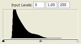
Jujutacular's dirt and scratch removal was very careful, yet the image remains badly faded.  Here's what that fade looks like on a histogram.  A histogram assigns all the pixels on an image a brightness rating from 0 (for black) to 255 (pure white).  Faded images lose data at the left and right ends of the graph.

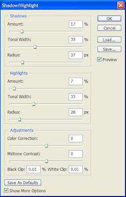
Image editing programs offer several ways to correct for fade.  The Shadow/Highlight tool in Photoshop is a powerful way to coax detail out of the shadows.

This tool has three sets of sliders.  The top section controls shadows and the middle controls highlights.  Those are the only two sections we'll need for today.  The top bar in each section, "Amount" controls the amount of enhancement.  The "Tonal Width" and "Radius" bars control the data selected for enhancement.

The shadow/highlight tool shows previews in real time.  So the best way to get familiar with it is to open it up and play around with a few images.  A good fade correction brings out the information you want to see without overpowering changes.

The final version of the Henry Clay engraving had minimal editing after the Shadow/Highlight adjustment.  Notice how much clearer it becomes.

Although I admire the detail of this engraving, overall it's a period piece not quite to my taste.  The postures are stiff and theatrical.  He looks more like a third rate actor playing a senator than an actual senator.  Yet it's a good example of an artistic style that was popular during his career.  Have a look and we'll move on to a twenty-first century portrait.

One type of problem that's probably happened to everybody is the indoor portrait taken next to a bright window.  The human eye adjusts to brightness differences better than any camera.  So this type of pose usually seems like it ought to look fine but gives disappointing results.  Here's an example with Philippe Beaudette who works for the Wikimedia Foundation.

Poor Phillippe looks like he hasn't been outdoors in a month.  He doesn't really live in a cave; it's just the lighting.  The first edit was a mild perspective crop to take out distracting architectural elements at left and right.

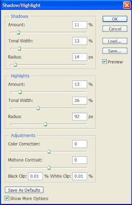
Then I wanted to put texture and color back into his face, but not too much.  The aim is to give his forehead definition without exaggerating contours so much that the skin looks blemished.  On the highlight slider an unusually large radius setting (92 pixels) produced a pleasing effect.  The edits to the shadow mostly brought out details in his sweater and hair.  I don't want to bring out very much of the shadows, though, because too much could produce the dreaded five o'clock shadow.

Unfortunately the current version of GIMP doesn't have an equivalent editing tool to Photoshop's Shadow/Highlight feature.  GIMP users can coax somewhat similar effects from the Curves tool.

Afterward I increased yellow by a small amount in the midtones and highlights, then boosted the saturation slightly.  Very small increases to saturation often make a subject look healthier. The edits almost gave him a tan.


Friday, January 22, 2010

Shades of gray


How do you color balance a black and white image?  Today's restoration is an Egyptian camel transport photographed at Mount Olivet near Jerusalem in 1918.  It was scanned from a print in an old album.  Paper tends to get deficient in blue as it ages.  Old photographic prints turn color in similar ways to old newspapers.  So this photograph appears to be shades of brown; what do you do about that?

Some people think that black and white photography ought to look black and white. Others prefer sepia tones.  We probably can't resolve differences of taste, but it's worth a look at what happens with both approaches.  They each have their shortcomings.  You'll also see the solution that I think works best.

Desaturation is a simple edit.  Here's a screen shot of how to perform it in Photoshop.

If you're editing in GIMP the Desaturate option is on the Colors menu.  Here's the result you'll get in either program.


This may be totally justifiable on technical grounds, but desaturation tends to convey an emotional coldness.  The original is a gorgeous panorama.  This doesn't have the same appeal; I don't feel the urge to lose myself in it the way I did with the original.

So why not keep those warm sepias just as they are?  If you're really restoring the image that won't be feasible.  The trouble develops when you work with the histogram.  Without getting too technical about it, old images usually fade.  And when you correct for that fade (in terms of brightness), any discoloration will seem to be intensified.  As a demonstration we'll do a simple levels adjustment on a partially restored version of this image.

Notice how artificial this looks.  This photograph was well preserved and had a good histogram for something ninety years old.  In an average print of similar age those browns could turn bright orange.


One possible solution is to leave both the histogram and the colors alone, and to only perform dirt and scratch removal.  That would keep the sepias untouched but lose whatever detail might be recovered from the shadows.  My solution is a compromise: I worked on the histogram with the Photoshop Curves tool (which is a more sophisicated cousin to Levels), then I adjusted the color balance by hand and did a partial desaturation.

Since old paper is deficient in blue, a color balance adds blue.  This means moving the bottom slider toward blue and the top slider toward cyan.  Photoshop allows the user to adjust highlights, midtones, and shadows differently.  I like to start with highlights because usually blue is more deficient in highlights.  That makes sense if you think of paper prints turning color like old newspapers: the dark areas have more ink, which conceals some of the change that occurs in the paper.

For this adjustment I moved the sliders four units toward cyan and blue in the highlights, then three units toward cyan and two toward blue in midtones, and one unit each in shadows.  Don't worry too much about remembering those exact numbers.  When you're editing just use the preview function and adjust the settings until they feel right.

Next I reduced saturation in the Hue/Saturation dialog.  This lets an editor take out some of the color while still leaving enough to to keep that emotional allure.  The sepias won't be overwhelming anymore, but they're still there.

The equivalent editing tools can be accessed in GIMP by choosing Layers >  Colors > Color Balance for color edits, and Layers > Colors > Hue-Saturation.

Here's the end result of my edits.  You might prefer a slightly different final version.  Photography is an art; so is digital image restoration.  The unedited Library of Congress file is available here.  Soon I'll be uploading my work on the image to Wikimedia Commons including an interim edit that doesn't include my final changes to the histogram, color balance, or saturation.  Feel free to work with that if you'd prefer something a little different.