Our first example depicts Senator Henry Clay of Kentucky who was one of the influential legislators of the nineteenth century. The edit at the top of this post was done by a classical guitarist who volunteers for Wikipedia under the username Jujutacular. Jujutacular has also uploaded several musical performances under free license and fellow editors have selected his work as featured sounds. An example of Jujutacular at guitar is here; it plays best on the Firefox browser. Jujutacular also restores historic images and yesterday I helped him with the image edit, which he had done from this Library of Congress original.
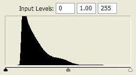
 Jujutacular's dirt and scratch removal was very careful, yet the image remains badly faded. Here's what that fade looks like on a histogram. A histogram assigns all the pixels on an image a brightness rating from 0 (for black) to 255 (pure white). Faded images lose data at the left and right ends of the graph.
Image editing programs offer several ways to correct for fade. The Shadow/Highlight tool in Photoshop is a powerful way to coax detail out of the shadows.
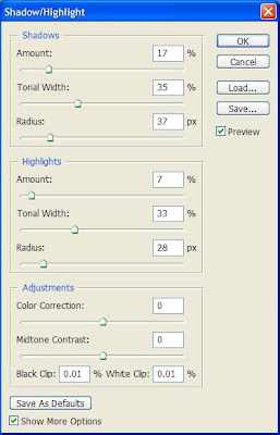
 This tool has three sets of sliders. The top section controls shadows and the middle controls highlights. Those are the only two sections we'll need for today. The top bar in each section, "Amount" controls the amount of enhancement. The "Tonal Width" and "Radius" bars control the data selected for enhancement.
The shadow/highlight tool shows previews in real time. So the best way to get familiar with it is to open it up and play around with a few images. A good fade correction brings out the information you want to see without overpowering changes.
The final version of the Henry Clay engraving had minimal editing after the Shadow/Highlight adjustment. Notice how much clearer it becomes.
Although I admire the detail of this engraving, overall it's a period piece not quite to my taste. The postures are stiff and theatrical. He looks more like a third rate actor playing a senator than an actual senator. Yet it's a good example of an artistic style that was popular during his career. Have a look and we'll move on to a twenty-first century portrait.
One type of problem that's probably happened to everybody is the indoor portrait taken next to a bright window. The human eye adjusts to brightness differences better than any camera. So this type of pose usually seems like it ought to look fine but gives disappointing results. Here's an example with Philippe Beaudette who works for the Wikimedia Foundation.
 Poor Phillippe looks like he hasn't been outdoors in a month. He doesn't really live in a cave; it's just the lighting. The first edit was a mild perspective crop to take out distracting architectural elements at left and right.
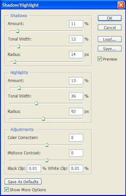
Then I wanted to put texture and color back into his face, but not too much. The aim is to give his forehead definition without exaggerating contours so much that the skin looks blemished. On the highlight slider an unusually large radius setting (92 pixels) produced a pleasing effect. The edits to the shadow mostly brought out details in his sweater and hair. I don't want to bring out very much of the shadows, though, because too much could produce the dreaded five o'clock shadow.
Unfortunately the current version of GIMP doesn't have an equivalent editing tool to Photoshop's Shadow/Highlight feature. GIMP users can coax somewhat similar effects from the Curves tool.
Afterward I increased yellow by a small amount in the midtones and highlights, then boosted the saturation slightly. Very small increases to saturation often make a subject look healthier. The edits almost gave him a tan.


2 comments:
You've done a really good job here. Those subtle changes make a big difference to the quality and the overall effect of the picture. Those tips are really helpful.
Thank you very much. :)
Post a Comment