Monday, November 30, 2009

Arbitration voting guide

People have been asking for recommendations on this year's Arbitration Committee candidates.  So here's a rundown of principles and useful links.

The Arbitration Committee's core function is to weigh evidence against policies in conduct disputes.  The Committee is also a final venue for community sanctions appeals and they do a few other things which privacy issues require keeping offsite, such as ensuring that checkusers and oversighters are trustworthy.

It's equally important to remember what the Arbitration Committee is not: its mandate does not include content disputes.  In 2003-2004 ArbCom was created in tandem with the Mediation Committee and the specific mandate of content resolution was designated to MedCom.  The Arbitration Committee does not write Wikipedia's policies or guidelines.  It is not a governance body.

Arbitrators have to solve Wikipedia's toughest disputes.  These include several long running conflicts which involve a dozen or more editors and have lasted for years: ethnic, nationalist, and religious disputes, as well as several others.  The level of interaction within those disputes sinks so low that in some of them serious offsite harassment occurs.

A good candidate for arbitrator should come to the position with formal dispute resolution experience, so they're aware firsthand of the problems that happen in dispute resolution.  There are six types of formal dispute resolution at Wikipedia:
Half of those processes have designated volunteers:
Other relevant processes include oversight and checkuser:
Script-generated measurements of a candidate's contributions can undervalue the people who are active in these areas.  Mediation, clerking, and checkuser all require careful attention so the people who do them spend a lot of time reading and evaluating.  This yields a high percentage of Wikipedia namespace edits and, often, a relatively low edit count.  So when checking out a candidate, look to see what they actually do.

An ideal arbitrator is someone who puts doing the right thing ahead of politics.  Good arbitrators make hard decisions.  When mud is being thrown they wash it off, even if they're pressured to apply adhesive.  Good arbitrators don't twist logic into knots to avoid offending someone who has political connections.  As a result, the best candidates for arbitrator usually have made a few people unhappy.

"Drama" is a word that gets tossed around too carelessly.  The important thing is to see whether a candidate who has been in a controversial area has been making it better or making it worse.  One useful approach is to survey a candidate's actions during several controversies where most of the circumstances are different but some of the same names appear.  If the candidate invokes opposite principles while consistently supporting the same people, that's a big red flag.

Another consideration is content experience.  Wikipedia is an encyclopedia and it's good to have arbitrators who understand that firsthand.  Yet it's possible to take the content emphasis too far.  Featured articles are the palaces of Wikipedia; arbitration occurs in its slums.  It certainly is worthwhile for arbitrators to have contributed featured content, but once a person has done it a couple of times, they get the point.  A person who has written twenty featured articles but not done much else could be a babe in the woods when they get to arbitration.  Or worse, they might try to expand the Committee's mandate into content where it doesn't belong.  Balance of power is a good thing.  Let's elect a Committee that keeps it that way.

Sunday, November 29, 2009

Parsing statistics

The BBC has published Wikipedia's rebuttal to statistics about a dropoff in editors.  If one uses different criteria and defines "editor" at a minimum of 5 edits a month instead of 1 edit, then the departure rate drops from 49,000 to 4,900 and the actual inflow/outflow of editors is at stasis.

Since those numbers differ by an order of magnitude, I'm curious to see a more in-depth approach.  What percentage of posts by 1-4 edit editors were reverted as vandalism?  And how does that compare against those who edit more frequently?

Possibilities to explore:
  • Good faith newcomers are getting driven off by aggressive reversion?
  • Breaching experiments are on the decline?

I have a hunch that reversion is somewhat more vigilant toward editors who haven't registered, or who have redlinked userspaces.  Also have a hunch that there is a large but limited pool of people who conduct breaching experiments without actually intending to contribute.  In the latter scenario, most of the people whose main intention is to test the edit function have already written "hi there", gotten reverted, and left.

It might be possible to measure those behaviors in relative terms.  One approach would involve tracking how many edits the average new account makes before the user talk and userpage get created, and by comparing the reversion rates of edits from accounts that are fully bluelinked, partially bluelinked (talk page but no user page), and fully redlinked.  Another approach would be to parse the rate of short-history editors whose posts include the words "hi", "hello", or "test".

Saturday, November 28, 2009

Open Progress


Expressing special thanks today to Gerard Meijssen and the Open Progress Foundation for outstanding work opening global access to digitized material from great cultural institutions in The Netherlands.  This week 35,000 images were uploaded to Wikimedia Commons, and due to the cooperative relations he has developed Wikimedian volunteers can obtain high resolution versions of selected highlights upon request, for restoration purposes.

Several months ago I expressed gratitude for these efforts by restoring an 1890s photochrom print of the Amsterdam Centraal railway station.  Today it's Wikipedia's picture of the day being highlighted on the site's main page.

Congratulations, Gerard.  This is for you.  Couldn't have happened to a nicer person.

Monday, November 23, 2009

Giving thanks


Most of the active Wikimedians are aware that the English language Wikipedia is largest in terms of total articles and the German Wikipedia is second, but it it comes as a surprise that the second largest featured program is not German but Turkish.

The English language Wikipedia currently has 2,111 featured pictures.  German has 747 featured pictures.  Yet the Turkish Wikipedia has 976 featured pictures.  That sets the Turkish language site in second place if one counts by Wikipedia editions.  To set this in perspective, the Turkish Wikipedia is nineteenth in overall size with 138,000 articles.  The German Wikipedia is on the verge of crossing the one million article milestone.

This means roughly 1% of the articles in the Turkish Wikipedia have featured pictures.  One featured picture can illustrate multiple articles.  That comes out as a far higher ratio than at any other Wikipedia of substantial size.

What's really interesting is how one medium sized Wikipedia developed a featured picture program that's 25% larger than the German program.  A core of perhaps half a dozen Turkish editors have been scouting other language projects' featured picture programs, translating the captions into Turkish, and adding the images to articles on their Wikipedia.  Featured picture content at the other projects is different enough from one site to another that the Turkish editors could amass three or four thousand featured pictures if they just keep doing what they're already doing.

Of course I hope they also knock on the doors of museums in their home country. Also very curious about whether this generates synergies with text edits and improvements at their Wikipedia.

Two things happen universally when people from other parts of the world see restored featured pictures about their own culture:
  1. They're delighted.
  2. They want to share information.
Now and then I do restorations about Turkish history and culture, in gratitude and to give their project an extra boost.  The most recent of these is the 1917 Ottoman heliograph crew at Huj pictured above.  Its featured candidacy is underway at the Turkish Wikipedia.  Last week the Turkish Wikipedia passed Wikimedia Commons as the project where I have the second most featured content credits.  Darned if I understand the discussion other than the succession of green light icons.

The Turkish editors have created a model that can be emulated.  And I'm very interested in trying a pilot project with another Wikipedia to see whether a caption translation and featured picture drive would provide a shot in the arm in terms of editor participation and article growth.

One place where I'm proposing a pilot program is the Irish language Wikipedia.  They already have a small featured picture program (two dozen images, a quarter of which I restored) and I know one of their administrators (hi there Alison) and have done a few restorations specific to her country and culture.  A few days ago President Kennedy came up in conversation and I asked whether she knew en:wiki has a featured picture of his brother.

There's Robert F. Kennedy at a CORE rally in 1963: the Attorney General of the United States speaking from the steps of the Justice Department in favor of racial equality.

Very cool.

Right now the Irish Wikipedia is the ninety-second largest Wikipedia with 9,274 total articles.  If their editor community is willing I'd like to help them emulate the Turkish featured picture program.

Although I can't speak a word of either language, if a picture is worth a thousand words we can hold a conversation.

Sunday, November 22, 2009

Letter perfect


Thumbnail previews and reduced size views don't always reveal how much work a restoration is going to require.  This World War I era poster is in very good condition.  At the web-optimized reduction for this blog post it hardly seems to need any restoration at all.  A closer look at the full size file, though, shows that this won't be a walk in the park.

It's a mostly good image with several tricky problems including a crease that runs vertically through the Statue of Liberty's hand and torch.  Today let's look at the ink smears.  It isn't unusual to encounter smeared lettering on historic posters.  Often the source of the problem is water damage.  In this instance it only affects the line that was printed in black ink.  Most of the caption is gray and doesn't have this problem, but the entire line of black lettering has ink smudges.

In case you're wondering, this poster translates to say, "Food will win the war - You came here seeking freedom, now you must help to preserve it - Wheat is needed for the allies - waste nothing."  It was printed in 1917.

Here's the most heavily damaged word at full resolution.  I actually perform the restoration at twice that resolution, but this is enough to convey what the work will be.  The basic idea is to trace the outline of each letter and substitute undamaged paper texture in place of the ink smears.  Two factors will make the difference between a mediocre repair and a good one:
  • Paper texture in historic images is not created equal.  Slight differences will occur in brightness, color balance, and roughness.  So the source area has to be chosen with an eye for those subtle distinctions or else the result will look patchy.
  • The letters have to look like they exist naturally within the cloned area.  This means the cloning has to mimic the aliasing that occurs in undamaged regions.

My first passes worked mostly with large areas and a tool setting of 12 to 15 pixels in diameter.  The source area for this cloning comes from an area that looks a bit rougher and more textured than most of the poster.  Our goal here is not to create something that's digitally perfect, but that fits seamlessly with the surrounding image.  The aim is to mimic good printing for 1917.

The narrowest parts between letters have to be done at a tool diameter of five or six pixels.  Unfortunately this is a situation where Photoshop has a big advantage over the current version of GIMP.  The Photoshop clone stamp tool has a sliding option that allows the user to select any percentage hardness.

Hardness affects how much a cloned area blends with surrounding data.  One hundred percent hardness looks like the cloned area was cut with scissors and pasted in.  Zero percent hardness is really soft and smudgy.  Smudgy is what we're trying to get away from, so we do want some hardness here.  But we don't want the text to seem like a ransom note or an old punk rock poster.  So what's needed is something in between.  A static setting is going to lose its subtlety as this work progresses from wide spaces to narrow gaps between letters.  I do most clone stamping at thirty-five percent hardness.  Getting down to half a dozen pixels, though, it helps to be able to drop that to twenty percent.


This is where GIMP users get caught between a rock and a hard place.  Hardness in GIMP is a simple on/off toggle.  If there's a plugin to make that more nuanced I'd love to know about it because the GIMP editors who work with me have real trouble with this sort of challenge.  They can get an acceptable result with the default program if they work hard enough, but it takes them several times as long as it takes me in Photoshop.  GIMP is open source, so if you happen to be a motivated programmer who likes to see this work spread free culture you could do something to help solve this problem.

I fixed the smudges on this row of text in about two hours.  If discussions with good GIMP editors are accurate, multiply that by a factor of three to five for them to get a result of comparable quality.

The full version of the completed restoration can be viewed here.  Below is a glimpse of it.


Saturday, November 21, 2009

Warm welcomes

 
More good news: another editor has gotten into image restoration and doing really good work.  The image above is a historic isothermal chart from 1823.  Jujutacular ran it as his first restoration about a week ago.  His first effort was impressive and it was a treat to see that he had gotten it from the New York Public Library website.  The pool of resources for source material is broadening.

The version Jujutacular ran as his first nomination is better than my early work.

That represents quite a lot of cleanup.  His effort really shows on the upper margin and far left.  I was on the fence about the nomination--didn't want to rain on his parade yet thought the restoration could go even farther.  Took a chance and offered to collaborate.  It turns out he's a really good sport, eager to learn, and a joy to work with.

He had a version saved without the histogram adjustment.  Smart fellow!  We traded off on additional dirt and smudge removal; both of us applied masks to correct the uneven brightness.  I added a perspective crop, patched in a margin at the lower right edge, and did the final tweaks with curves and color balance.  Sometimes it's magical when the final work feels like a time machine.  This was one of those occasions.

There's nothing quite like the moment of enjoying an editor's reaction for the first time when he realizes, "I did this."  So cheers to Jujutacular.  Looking forward to seeing his next project.

----
Per request, adding links to the full versions:

Friday, November 20, 2009

What is a stain?


The Tropenmuseum has provided a very special challenge.  This post is probably the first glimpse of it to become visible to the public.  Roughly speaking, it's something like the Bayeux Tapestry of Indonesia.  The museum had it professionally photographed in twenty-nine parts.  Then they discovered that none of the digital segments quite matched together: the lighting was slightly uneven from left to right and the thin tapestry fabric had shifted so that the fibers and images no longer matched neatly.  These problems affected every one of the twenty-nine segments; the museum staff thought the image couldn't be stitched.  We've had very enthusiastic responses from the museum staff now that I've pieced it into a single file.  It's a huge job: 992.4 MB.  Now it gets interesting.

There's a lot more to be said about the digital restoration on an image that's nearly a gigabyte than one blog post can encapsulate.  One part that's easy to recognize is the large brown stain that runs vertically along this segment.  Today's post takes a different approach to repair than the last post because this time the original design remains visible within the damaged area.

In terms of digital image data, this stain consists of three elements:
  • Brightness
  • Color
  • Contrast
If one thinks of a stain as too dark and deficient in blue and lacking contrast, then the way to eliminate the stain is to brighten, add blue, and restore contrast.  The concept is simple.  It's mainly a matter of creating enough masks to make the corrections in small increments.  Stains tend to be uneven so different portions require individual adjustments.  Here's an interim save as it looks on my monitor right now.

The proportions on this are reduced substantially from the original file, which was 13MB on this cropped area.  Yet it can be informative to see the work before the stain removal is complete.  No cloning has been done at all in this stain correction.

Wednesday, November 18, 2009

President of Suriname visits WMF partnered museum exhibit


Good news from The Netherlands.  President Ronald Venetiaan of Suriname has visited the Tropenmuseum exhibit about the cultural history of Suriname.  First Lady Lisbeth Venetiaan saw the exhibit last Saturday and was so impressed that she returned with her husband the next day.  The Suriname exhibit was developed in partnership with WMF Netherlands and the Open Progress Foundation.

Sunday, November 15, 2009

Difficult repairs


The image above is an interim save on one of my current projects: an early nineteenth century Japanese woodblock print of the ram from the Chinese zodiac.  The artist is Gogaku Yajima, who doesn't have a Wikipedia biography yet. It's an attractive print, but as you can see from the lower right corner this isn't in pristine condition.  Have already spent about seven or eight hours to bring the restoration this far.  What follows is a close-up of the upper border before starting work on the hardest part of this project.  Notice the odd mark that branches downward from the upper edge.


At a glance it looks like really sloppy click-and-drag clone stamping, but close up the problem isn't consistent with post-digital alteration.  My best guess is that the rice paper print developed a tear and that the mark represents an attempt at physical repair.  Someone might have added a reinforcement to the reverse side of the paper and used an adhesive.  Then, since the repair could have occurred generations ago, over time the adhesive had a chemical reaction with the paper which resulted in that branching stain.  It would be interesting to contact the library staff and see whether this guess is accurate.  But for today the challenge is how to make it disappear.

For starters, here's a closer look.  The border is a repeating pattern of cherry blossoms.  This takes careful study because reconstruction of the design involves inferring the shapes of three flowers and a bud.

Repairs to complex areas such as this are much more difficult than repairs to solid colors.  A photograph print that gets torn at a cloudless sky could be fixed in a minute.  Damage to near-random features such as a sandy beach or a grassy field are also fairly simple.  This is a different matter.

When I look at this type of image I estimate the difficulty in terms of five elements:
  • How many color borders or line demarcations does the damage cross?
  • Does enough information remain to infer the shapes of the missing areas?
  • Is the damaged pattern repetitive or unique?
  • Is there enough similar data elsewhere in the image to patch a repair?
  • How much importance will the viewer attach to the damaged region?
This bit of damage interacts with the woodcut design in complex ways.  If I want the repair to look seamless, and I do, it's going to take a few hours to get this right.  Here are a few close-ups from screen shots as the work progressed.  You'll see how, progressively, I fixed areas and inferred colors and shapes.


In the far right frame I actually altered one petal, which is something I don't like to do.  That particular area had sustained so much damage that I had difficulty understanding what the shape was intended to be.  If I'm a stickler I might go back and recreate that petal again, because after a day I had better ideas.  These are the kinds of decisions that make me bite my lip.  If the feature were a face instead of a flower I wouldn't have attempted to alter it.

After a bit more cleanup around the edges, here's how that area looks now.


Monday, November 09, 2009

We are all Berliners


Not that it was likely to kill me, but I happen to be one of the last people who crossed the Berlin Wall illegally.

Twenty years ago it was delightful to follow the news about Czechoslovakia opening its borders, and East Germans crossing that way and seeking asylum.  Then when it seemed that political pressure was closing the opportunity, one magical day the people from both sides of Germany stormed the Wall and the guards laid down their rifles.

But the Berlin Wall didn't absolutely disappear overnight.

That fall I was a taking a course on the history of German unification in the nineteenth century.  Took a seminar in Germany since 1945 the following spring.  An opportunity like this doesn't happen twice so I also enrolled in a conversation course to brush up my German and spent a month in the country after graduation.  Reached Berlin in June three days before the authorities dismantled Checkpoint Charlie.

By that time Germany was still two separate countries on paper, but they had already worked out most of the details for reunification.  Germans from either side of the internal border could legally cross anywhere, and European Union members had additional crossing points.  Not everyone was so lucky.

I was visiting the Brandenburg Gate, pictured above, and there was the wall in the way.  Most of it was still standing.  On the other side was Unter den Linden--the famous avenue with the city's best museums.  One of the new checkpoints was right there.  "Reisepass, bitte."  The official waved me away after one glance at my United States passport.

The city was changing so quickly that year that travel guides were obsolete as soon as they were published.  The only thing do to was follow the news and use one's wits.  Berlin was so filled with tourists that I nearly resorted to sleeping on the floor of a convent.  Fortunately my language skills were good enough to use the local Mitwohnzentrale.  Negotiated a short sublet on a comfortable apartment.

So there I was at the Brandenburg Gate, unable to get to the museums.  There was one other thing to see on the western side: a line of crosses.  The citizens of West Berlin had erected informal memorials to each person who had died trying to get across.  Most of the memorial crosses had names and birth dates.  A few only listed the date and time of death.  They were all in chronological order; the very last was dated February 1989.  "If only that person had waited a few more months," I thought.

Right then I decided I was going to break that law while it was still possible.

The question was how to do it.  The subways had resumed operation between the two halves of the city.  So the first plan was to blend into the crowd.  Wearing Nike running shoes, no one would mistake me for an easterner.  But a good accent had gotten me through the Inner German Border on the way to Berlin without absolutely having to undergo a passport check.  "Sind Sie Deutsch oder Ausländerin?"  Tough choice, but an East German border crossing stamp would make a good enough souvenir.  Had told the truth, but the border guard didn't bother to stamp the passport.  So a day later, standing at the Brandenburg Gate, it seemed possible that maybe the Hamburg accent I had learned from my grandmother would bring another opportunity to pass for a German.  In order to look more local I carried a newspaper under one arm.

It was easy to tell when the train got to the Eastern side: the track suddenly got about three times as noisy.  Disembarked to the platform, but then--an amazingly strange sight--every single person pulled out a passport to obtain permission to leave the station.

Dangit.

So this wouldn't be easy.  After several hours of playing musical subways and other subterfuges I gave up and went to Checkpoint Charlie.  The outer guard was smiling broadly and posing for tourists.  The guidebook said to expect about a ten hour wait, but the spot was nearly empty.  Walked up to the counter and paid five marks to The Man for a day's visa.  The System had won.

By then it was nearly sunset so Unter den Linden was out of the question.  The museums had already closed.  Wandered a few blocks past one of the first commercial billboards to appear in a Communist country, and walked over to a patch of Wall.

Back during the Cold War, when they were serious about it, I wouldn't have been able to approach within several meters of the Wall from the eastern side.  Not if I'd expected to survive.  But by June 1990 sharpshooters had quit their jobs and it was possible to walk right up.  If I couldn't cross that wall illegally I could at least help to destroy it.  That hour did more damage to my Swiss Army knife than to the wall, but it broke loose several handfuls of pebbles that made superb presents for friends back home.

Had to quit before twilight ended.

Normally I have a good sense of direction, but this was a strange city and nearly nightfall.  So although I thought I was retracing my steps to Checkpoint Charlie somehow I took a wrong turn.  Wound up staring down a dead end and wondering how I had gotten there.

Technically the Berlin Wall was two walls--an outer segment and an inner segment.  They used to rake several meters of sand in between every day in order to make it easier to track footprints and shoot people.  Above and to the left was a watch tower, but the paint was peeling and it hadn't been manned in months.  In a few places the walls had been broken with gaps in between.  One of the gaps was there.  The sand hadn't been raked in months and wildflowers were growing in it.  Wild rabbits were nibbling on the flowers.

A woman came in from the West Berlin side and walked her dog through that stretch.  Then a man on a bicycle came up from behind me and walked his bicycle across.  They were Germans.  It was legal for them to cross anywhere.

Hm.

Looked left, looked right, and thought "What are they going to do, shoot me?"

So I escaped from East Berlin.
----
If you want to honor the memory of the people represented by that line of crosses you can restore the image at the start of this post, the photographer Toni Frissell has donated it to the public domain.  The uncompressed TIFF version is available for download here.

Sunday, November 08, 2009

Bringing down the house


Let's face it: really old disasters are fascinating.  Pictured above is the aftermath from the the Galveston Hurricane of 1900.  If any of those children are still alive the youngest would be about 117 years old now.  Galveston has long since been cleaned up and rebuilt.  We can call this sort of photograph educational because it probably is--sure makes me want to live somewhere else than Galveston...as a wiki witch I avoid places where houses fall.  But heck, this photo also serves the human desire for guilt-free rubbernecking.

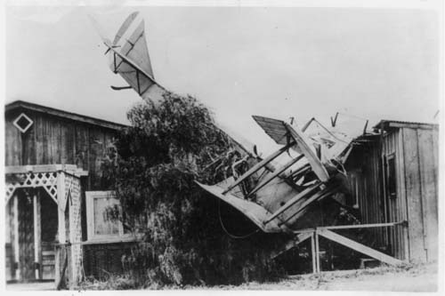
Ready for more?  Another house, smaller disaster.  Published in April 1919.  (Yes there's a point to this; continue reading after the requisite gawk).

The Library of Congress had an unconfirmed record which called this a French biplane.  Two Military History Project members have identified this as a Curtiss JN-4 "Jenny", which was the best known United States biplane of World War I.  So thank you, Monstrelet and Eurocopter!  The Curtiss JN-4 "Jenny"...it'll be easier to remember that name now.

Friday, November 06, 2009

Palenque revisited

The bas relief at Palenque has deteriorated a lot since 1787 when Ricardo Almendáriz sketched it.  Thanks go to Infrogmation for spotting this 2008 photograph of the same panel.

And here's another look at the digitally restored version of the 1787 drawing.


Thursday, November 05, 2009

Goals


Awadewit is among the Wikipedians I most admire: a prolific contributor of high quality articles on scholarly topics, and a joy to work with.  She's completing her dissertation in eighteenth century children's literature this year, so as a gesture of thanks for her hard work I've done a little restoration for her today.  She surprised me last month by saying she's actually used my restorations as examples in the introductory undergraduate classes she teaches. Well here's something closer to her real world scholarship: a William Blake illustration for Mary Wollstonecraft's Original Stories from Real Life.

"Wow - they look so different from the Blake versions - so much softer" was her first reaction.  After a moment of poking through the bibliographic notes I confirmed a suspicion: this is indeed the Blake version, scanned from his original sketch for the frontispiece.

Here's wishing the digital file were higher resolution.  The Library of Congress has been digitizing its collection for fifteen years; some of the older digitization isn't quite at the technical excellence of their recent work.  Equipment and formats have changed, and their staff has gotten better at it.  So this might be a viable featured picture candidate at English Wikipedia but the higher Wikimedia Commons technical requirements would exclude it from serious candidacy.

Nonetheless, a medium resolution file is usually less work to restore--the smaller damage just doesn't show up at this resolution.  So I did a quick restoration for Awadewit to cheer her on through the final months of the dissertation.  First, let's have a peek at the version of this image which appeared in the printed edition.


This is basically a mirror image of the sketch.  Maybe the Library of Congress has been spoiling me: the file that was in use at the Wikipedia article was less than 50 kilobytes.  It's stained, faded, yellowed, and suffers from distortion, plus the crop is so tight that it would be difficult to correct the problems if the filesize were large enough to work with.

Really, it's best to restore files that are at least 10 megabytes in uncompressed format.  I don't call an image large unless it's more than 100 megabytes.  On a fairly frequent basis other Wikipedians ask me to restore material that is only a few dozen kilobytes.  I can't produce a featured picture from that; the magic has its limits.

Getting back to this project, though, one issue worth mentioning is how to deal with staining.  Stains can be a problem when they occur over important parts of an image.  In this instance a large brown stain occurs on the central figure's knee.  I've blown this up to about double the original resolution.

This stain consists of two parts: a small deep brown spot surrounded by a much larger faint discoloration.  First I got rid of the small spot.  The easiest way to do that is with a clone stamp at 35% hardness, but with a careful and steady hand it's possible to get a more natural effect with the healing brush.  The healing tool algorithm usually works poorly in the middle of narrow stripes, but if the sample point is the same distance from a line as the destination point the tool can give a pleasant blended effect.  It's quite tricky to do this and often takes several tries because if it isn't done just right the tool will create an ugly smear.

Unnatural healing brush smears are a hallmark of poor image editing; that's something to really avoid.  If you feel like trying this trick the way to get the feel for it is by backing up through the history when a smear occurs (and you will make smears--a lot of them--so don't feel bad).  Don't try to re-heal a smear; it'll only smear worse.  Just choose a new source point, try to line it up just so, and eventually the spot will vanish perfectly.

Of course there's still the larger stain.  Low intensity stains are basically localized color problems.  So I treat this like any other local color correction: choose the selection lasso, set feathering to 10 pixels (which is not very much, but appropriate for a small image), and create an adjustment layer to manually adjust the colors.  Think of "brown stain" as "deficient in blue" and nudge the RGB sliders until the colors appear consistent.  Don't try to be hasty and copy the same tweaks to the light, medium, and dark ranges: often the best results come from slightly different settings.

With additional work the final version comes out looking like this.
Three cheers for Awadewit and her Dissertation!   (Now Awadewit, go finish it). ;)

Wednesday, November 04, 2009

Spinal curvature


One problem with book scans occurs when the printing goes close to the spine and the page fails to lie flat on the scanner bed.  The subject here is a detail from the Mayan ruins at Palenque and the illustration carries particular historic importance: it was drawn by Ricardo Almendáriz in 1787 during the initial excavation of Palenque and his illustrations formed part of the first significant archaeological report in the Americas.

The lower left corner on this image makes it a bit more challenging than the other perspective crops of recent posts because the others could all be corrected with a single perspective crop.  This requires multiple perspective fixes.  After the first set of changes the lower left corner still curls upward and inward.  The effect is most apparent at the horizontal border line.  That distortion affects the entire far left column of the image.

We're lucky in one way: other than border, only the lower half of this drawing contains information at far left.  So the solution is to select the distorted segment from the seated figure at left and create a new image file solely for that partial figure, then perform a second perspective crop on that segment only. After that, copy and paste the segment to the original image as a new layer and align it so the correction becomes invisible.  It's easier said than done.

Here's how it appears after the correction.  The change is subtle but it alters the proportions of the figure's hip and spine.  Alignment and blending require judicious erasure, partial redrawing of border lines, and minor edits at high resolution.

Other than that the restoration was routine.  The drawing is in better shape than most comparable material of the same age, but it still took several patient hours of dirt and stain removal to complete the work.

One of the interesting things about the Almendáriz drawings is that he recorded features which have since been destroyed by exposure to the elements.  Comparison against the remaining undamaged bas reliefs shows that his work was unusually accurate for its era.  So this remains useful to modern scholars.


Tuesday, November 03, 2009

Heritage


At right is a spectacular portrait of Willy Brandt, former German chancellor and Nobel Peace Price winner.  He was mayor of West Berlin when the Berlin Wall was built.  His likeness was nominated for featured picture at English Wikipedia earlier this year, but failed on technical issues.  Brandt's portrait was part of a very generous donation from the German National Archive.  Yet at 568 × 800 pixels, file size: 47 KB it just didn't meet the minimum criteria.

Several months ago I performed a courtesy restoration on a higher resolution portrait of Konrad Adenauer, which unfortunately can't be uploaded to Commons because the Bundesarchiv retained full copyright over its high resolution digitized files.

So if it's possible, I'd like to renew the request to Bundesarchiv to seek selected copies of higher resolution material.  The lighting and expression on this Brandt portrait is brilliant; he deserves attention on the site's main page.

There's another reason to make this request.  There's another image that was nominated for delisting nearly two years ago, and it was retained because a cultural institution donated a higher resolution version.  Featured content criteria tend to rise over time, and the lower resolution version had been nominated and promoted before the standards changed.  It's quite famous.

The final days of the Warsaw Ghetto Uprising.  Many thanks to the United States Holocaust Memorial Museum for their assistance.  The lower resolution version had been on the route to delisting.  Since then the photograph has been featured on several projects including the Turkish Language Wikipedia.  It's amazing how far one donation can go toward raising awareness.

One reason I'd love to be able to upload a better resolution version of Adenauer or Brandt is for balance; not everybody in Germany during World War II agreed with the government's policies at that time.  Adenauer and Brandt were among the people who helped rebuild Germany into a respectable country again.  It takes a special sort of leadership to steer a country that had gone off on such a bad course back to stability and democracy.
----
Image credit:
http://en.wikipedia.org/wiki/File:Bundesarchiv_B_145_Bild-F057884-0009,_Willy_Brandt.jpg

Monday, November 02, 2009

When you've seen one Edwardian field marshal, you've seen 'em all


Props to Roger Davies!  The Library of Congress staff has emailed to confirm that they will be correcting their records regarding the identity of the man in the recently promoted featured picture at right.  This is not Herbert Kitchener, 1st Earl Kitchener but Frederick Roberts, 1st Earl Roberts.  Roger Davies noted differences in age and facial structure, and in particular the Victoria Cross at lower right which Roberts received, but not Kitchener.  Roger Davies also found two reliable sources for Earl Roberts as the subject of this poster: the Smithsonian Institution and VADS (a joint project of the Imperial War Museum, the British Arts & Humanities Research Council, and Manchester Metropolitan University).

The updated information should be available at the Library of Congress website within a month.

In the meantime we'll need to do a little bit of housekeeping at the wikis because the featured picture candidacies and the relevant filenames all contained Lord Kitchener's name.

This goes to show that reliable sources aren't always perfect.  With good reference works it is possible to improve the data that major institutions can share regarding their collections.  Here's another recent example: a portrait of John Surratt that the Library of Congress is updating per my feedback.

John Surratt was  a Confederate spy who conspired to kidnap Abraham Lincoln in 1864 and who was suspected of conspiring in Lincoln's assassination.  His mother Mary Surratt was hanged by the United States Federal Government for her part in the Lincoln assassination plot.  John Surratt survived by fleeing to Europe and serving as a Papal zouave; the statute of limitations on most of his activities had expired before he was identified and extradited.

The Library of Congress had misidentified him as the son of "Annie Surratt" and had misidentified his uniform as an Egyptian Army zouave rather than a Papal zouave.  The LoC record also dated this photograph "between 1860 and 1875".  The source Lincoln's Assassins: Their Trial and Execution by James L. Swanson and Daniel R. Weinberg narrows that time frame to 1866-1867 because the photograph was taken by an American photographer and was sold during Surratt's 1867 trial.  Swanson and Weinberg also confirm the other corrections.  The Library of Congress staff recently wrote with thanks for the corrections; their website should be updated within a few weeks.

I've started a restoration on Surratt's portrait but gotten sidetracked.  Interested in completing the project?  Welcoming collaborators; coaching available.

In the bigger picture, this sort of assistance constitutes a significant motivation for cultural institutions to digitize their collections for the public.  For example, a Swedish archive called Regionarkivet recently uploaded several dozen high resolution public domain photographs by major nineteenth century photographers to Wikimedia Commons in the hope that volunteers would locate more information about the material.  When this type of effort succeeds it achieves the best goals of the free culture movement.  I encourage everyone who can provide assistance to join the effort.  Digital editing skill isn't required; all it takes is a little research.


Not that it matters, but I've given Roger an award for his research.  If people like this I could submit it for formal barnstar approval.

Sunday, November 01, 2009

Bright ideas


It can be delightful to root through obscure corners of the Library of Congress website and unearth something special such as a high resolution full book scan of a beautifully illustrated volume.  This self-portrait of William Blake comes from Songs of Innocence and Experience, published 1794.  He's an important painter and poet; Wikipedia ought to have a featured portrait.

Every restoration has its challenges.  The main challenge in this one is that the aged paper does not lie flat.  Scanner light is highly directional so digitization enhances small buckles in the original image.  You'll see this as a series of bright and dark horizontal bands near his forehead, chin, and chest.  The example below is an interim save after initial dirt and scratch removal.

 
Distracting, isn't it? The brightness gradient tool can be used here, but it only helps a little bit.  The page itself is slightly brighter at the lower left corner.  So one quick gradient adjustment at a very slight setting is a first step toward correcting the problems.  In this instance I used about 2% opacity.  Most of these issues have to be solved another way. 

The solution here is to look at each buckled area in terms of what it changes about the image: brighter above, darker below.  This can be fixed incrementally with multiple feathered mask selections in a series of brightness adjustment layers: brighten the dark sections and darken the light sections.  The trick is to make plenty of layers, draw each one separately, and to change just a little bit at a time.  This restoration went through 30 adjustment layers, with feathering staring at 40 pixels and decreasing to 25 and 10 pixels, nudging the brightness about two notches at a time (sometimes one and never more than three).  The direct result of that follows:

That's more like it: almost like taking a gentle iron and pressing the paper flat (which of course we don't dare do to the actual physical copy).  The final restoration added only moderate changes to curves and color balance.

Images that have nuanced brightness or staining issues can be an exception to the usual time allocation in digital restoration.  Usually the bulk of restoration time goes into dirt and scratch removal.  In this instance dirt and scratches were minimal, but layered masks required plenty of attention.  The most difficult instances I've restored have needed as many as 200 brightness adjustment layers to correct for this type of problem.