
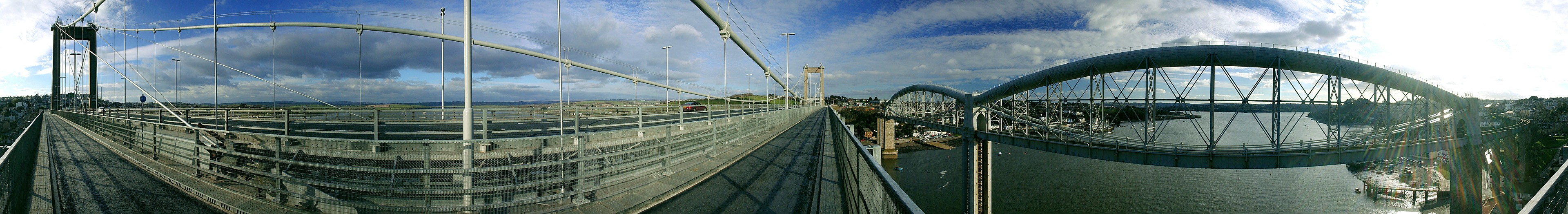
 Next month marks the fifth anniversary of Wikipedia's featured picture program. So to commemorate that occasion here's a quick look back at the beginning to see how far things have come. The bridge above was Wikipedia's first featured picture. Here was the discussion:
From Tamar Bridge and Royal Albert Bridge. I uploaded this image so I've put it in self-nominations, but it was taken by a non-wikipedian.
- Nominated by fabiform | talk 14:55, 1 Mar 2004 (UTC)
- Triffic!! (take that as a second) - Gaz 16:34, 1 Mar 2004 (UTC)
- Approve. I've never seen a panorama that inclusive. Bevo 17:43, 1 Mar 2004 (UTC)
- I heartilly approve, I've never seen anything like that... Sam Spade 05:16, 2 Mar 2004 (UTC)
Too distorted, blown highlights.
- Delist. - KFP (talk | contribs) 23:48, 17 October 2006 (UTC)
- Delist per nom. howcheng {chat} 22:17, 18 October 2006 (UTC)
- Delist per nom. --Steven 01:11, 19 October 2006 (UTC)
- Keep. A pity to delist this picture inspite of blown highlights. I don't think distortion is a problem, it reminds me of a M. C. Escher painting! -- Alvesgaspar 11:18, 19 October 2006 (UTC)
- Delist I always wondered how that got to be a featured picture in the first place. | AndonicO Talk 18:16, 20 October 2006 (UTC)
- Delist - how did this get through the first time? Yeuch. —Vanderdecken∴ ∫ξφ 10:45, 22 October 2006 (UTC)
- Keep the Earth revolves around a sun. Deal with it. drumguy8800 C T 01:11, 24 October 2006 (UTC)
- Delist Per blown highlights and distortion. HighInBC (Need help? Ask me) 01:12, 24 October 2006 (UTC)`
- Delist per nominator. -- Moondigger 21:37, 24 October 2006 (UTC)
- Question Are the bridges actually curved like this in reality? -Arad 22:22, 24 October 2006 (UTC)
- Delist; confusing. Laïka 22:31, 24 October 2006 (UTC)
- Delist per nom. Yuck. -- CountdownCrispy ( ? 22:33, 24 October 2006 (UTC)
- Question wheres the original nom? -- Coasttocoast 23:29, 24 October 2006 (UTC)
-
- Here. --KFP (talk | contribs) 23:33, 24 October 2006 (UTC)
- Thanks, lol it seems that every picture there has been delisted :D -- Coasttocoast 00:04, 25 October 2006 (UTC)
 Wikipedia saw 23 nominations during the featured picture program's first month, of which 14 were promoted. 11 of those have since been delisted. While reviewing the remaining 3 I noticed one that really wasn't up to current standards and nominated that for delisting also. It's a dust storm in Texas, but at 700 x 459 pixels and 68KB it just doesn't meet the minimum expectations.
For comparison, here's the discussion for one of last month's featured candidates: a shot of the harbor at Sydney, Australia. without its famous bridge:
Sydney Skyline at dusk

- Reason
- Shows the skyline of Sydney in an encyclopaedic and visually pleasing way. It is currently the lead image in the Sydney article.
- Articles this image appears in
- Sydney
- Creator
- User:Diliff
- Support as nominator --Diliff | (Talk) (Contribs) 21:53, 8 January 2009 (UTC)
- Comment I have to say that it is a nice image, but it would be good form to wait until the active discussion about the choice of top image has formed a consensus, especially as there has been talk about EV. Your image has only in fact been in the article for 24 hours. (I disclose that the previous image in the article was mine, it as been there for some time. Yours is a far better image photographically, I am not offended by it being replaced - mine was no more than a quick shot taken from a ferry that I thought would be useful to WP so I uploaded it, i am not proud of it at all.) But it feels a bit off to self nominate yours for FP at this point, especially in light of recent discussions about self nomination and the length of time images have actually been in the host article. Mfield (talk) 22:20, 8 January 2009 (UTC)
- Well, fair enough. There didn't seem to actually be any discussion on the image on the talk page. The person who initially seemed against the image admitted they preferred the replacement once they saw it in the infobox and there was no other discussion since then. I'm happy to mothball the nomination for a while if desired. To be honest though, the EV of the image as a definitive skyline of Sydney in the article is clear. Even if it were decided to keep your image as the lead image, I'm fairly certain it would, as I mentioned on the Sydney talk page, be a good candidate to replace the skyline as viewed from Balmain further down the article. I wouldn't have nominated the image if I didn't think it stood a good chance of sticking there. As we discussed about self-noms and time periods, I thought we basically agreed that while it is generally safer to wait to confirm EV, there is no mandate for it and we should judge each case individually. As I said above, I don't think there could be much argument on the basis of EV. Diliff | (Talk) (Contribs) 22:32, 8 January 2009 (UTC)
- Comment I don't see the appropriateness of having this picture in the economy section of the Sydney article. For one it is not supported by text, none of the buildings mentioned in the text can be seen in the image and its features are to small. I also think that the previous image would be more suitable for the info box. Perhaps this would be more suited in the tourism section replacing the opera house pic and Just because it is a featured photo (soon) doesn't make it appropriate for that section. The photo that I have added to that section is supported by text and some of the institutions and a lot of the subject matter can clearly be seen in it. Adam (talk) 02:34, 9 January 2009 (UTC)
- What makes you think the previous image is better in the infobox? Also, I concede that this image doesn't show the logos on the buildings as well as the Balmain image, but it is a far more complete skyline of Sydney. I don't know if I would say that the text of the section relates to the buildings visible in the Balmain image. The only one I can see is Westpac, and the caption makes no mention of the economy. Anyway, I think if you want to discuss it further, we'd best take it to a talk page as this is getting beyond the reaches of the nomination. For disclosure, both Adam J.W.C. and Mfield are the authors of two images that this image has replaced or has been suggested to replace, respectively. Diliff | (Talk) (Contribs) 02:59, 9 January 2009 (UTC)
- I have already disclosed that if you'd care to have read my original comment, I have no bone to pick with the image being replaced, I have an issue with an image being proposed for FP whilst a discussion is still underway as to whether it should even be included in the only article it is now in. Mfield (talk) 03:30, 9 January 2009 (UTC)
- I know you did, and I did read your original comment. It was just a summary of disclosure regarding both you and Adam together. No need to get narky - it wasn't an attempt to undermine your disclosure.. As I said though, there actually was no discussion underway at the time I submitted this. The only objection raised on the Sydney talk page was withdrawn. Diliff | (Talk) (Contribs) 13:24, 9 January 2009 (UTC)
- I have already disclosed that if you'd care to have read my original comment, I have no bone to pick with the image being replaced, I have an issue with an image being proposed for FP whilst a discussion is still underway as to whether it should even be included in the only article it is now in. Mfield (talk) 03:30, 9 January 2009 (UTC)
- What makes you think the previous image is better in the infobox? Also, I concede that this image doesn't show the logos on the buildings as well as the Balmain image, but it is a far more complete skyline of Sydney. I don't know if I would say that the text of the section relates to the buildings visible in the Balmain image. The only one I can see is Westpac, and the caption makes no mention of the economy. Anyway, I think if you want to discuss it further, we'd best take it to a talk page as this is getting beyond the reaches of the nomination. For disclosure, both Adam J.W.C. and Mfield are the authors of two images that this image has replaced or has been suggested to replace, respectively. Diliff | (Talk) (Contribs) 02:59, 9 January 2009 (UTC)
Comment I'm supportive of the image, but I tend to agree there should not be ongoing dispute about it among contributors to the article (either here or on the talk page). Hard to assess its EV until we know it is going to be stable in the article. Tentatively I favor it for the infobox rather than the Economy section, as the Balmain image places the emphasis on the financial/corporate landscape; a broad overview of Sydney's skyline is less useful there. Fletcher (talk) 04:07, 9 January 2009 (UTC)
- To be fair, there actually wasn't a dispute on the article's talk page at the time I submitted this. I raised the issue on the talk page prior to adding it to the article, and one person had initial reservations about it, but when another contributor added it to the article of his own accord, they rescinded their objections and supported its inclusion. For all of the debate here, as far as I can tell Adam J.W.C is the only person who objects to the image in the article. Diliff | (Talk) (Contribs) 13:20, 9 January 2009 (UTC)
- Weak Oppose While visually it's pretty much perfect for a city nightscape, I'd have like the composition to also include the harbour bridge as in this pano you previously took. --Fir0002 04:08, 9 January 2009 (UTC)
- Wouldn't it be an almost identical picture to that previous one, then? :-) I actually intended to take the same shot as the previous FP when I was in Sydney, but because of the NYE fireworks, they had begun to scaffold the bridge up and it looked pretty awful so I delibrately excluded the bridge. I can appreciate that you might want a slightly different composition, but given that I cannot simply go back and re-shoot (I've been back in the UK for a month now), this is the image I managed to take. Are you opposing because you wish it were different, or are you opposing because it is really unsuitable to be an FP in its current form? Diliff | (Talk) (Contribs) 11:52, 9 January 2009 (UTC)
- Well I took it as a HDR upgrade to your existing one :) While I very much appreciate this being very difficult for you to redo, I do think that the bridge should be part of a lead panorama of Sydney as it's such an iconic part of that city (and at any other time of the year including it would have made perfect sense). So for that reason I think your existing FP has greater EV and thus I couldn't support this one nice as it is. --Fir0002 10:35, 10 January 2009 (UTC)
- I think the existing FP has a different purpose though - this image is suitable for the infobox and the existing FP works well as a panorama at the bottom. Yes, it would have been nice to include the bridge, but if I did, it wouldn't make a good thumbnail for the infobox and therefore would merely have been a candidate to replace the existing FP, rather than complement it. Besides, as Durova mentioned, not every image of New York City needs the Brooklyn Bridge. It is very difficult to get photo with a good composition, with non-panoramic proportions and the Opera House, skyline and the Harbour Bridge all in the frame. As an analogy, you already have a good FP of a kangaroo but you've nominated a new one with different characteristics. Some things about the new one are better (no man made elements in the background, shows feeding) but some things are worse (angle, less aesthetically pleasing composition/pose), but because it describes a slightly different aspect of the same subject, you thought it worth nominating. Same situation here IMO. This image wouldn't be fit for purpose if it included the bridge. Diliff | (Talk) (Contribs) 11:52, 10 January 2009 (UTC)
- I've never been to Sydney but is it possible to shoot from an angle similar to this? That would be one way to get the bridge and the opera house whilst retaining acceptable dimensions for the lead image. If it's not possible then I'll change my vote to Neutral because I can understand what you're saying with them illustrating different aspects. But just to let you know that other FPC wasn't actually successful so I haven't yet got a kangaroo FP :) --Fir0002 22:12, 10 January 2009 (UTC)
- Oh really? I was sure that last one went through.. Okay, nevermind, but you got my point at least! As for that image, well it might be possible. Sydney is a massive city with lots of coastline, but quite often it is difficult to get a good shot from public property, as all the good vantage points are obscured by multi-million dollar houses on the harbour. :-) Anyway, you can't actually see the skyline in it, so it may be cut off by other houses, I'm really not sure. It would take a lot of exploring to find the hidden gem shooting locations, I'd say. And as I said to Mfield below, some of them require access to people's balconies! As a mere tourist with limited scouting time, I was more limited to where the ferries happened to take me! Even this shot required a 10 minute walk through residential streets from the nearest ferry stop, or else a 20 minute hike across the Harbour Bridge and then down a few side streets. You sort of have to know what you're doing, to cut a long story short! Diliff | (Talk) (Contribs) 23:55, 10 January 2009 (UTC)
- On that note, I am waiting until next time to shoot one from here[10] (or better yet of possible from the land in the lower half of the frame) as it gives a nice broad view. Mfield (talk) 22:53, 10 January 2009 (UTC)
- That actually looks like a good spot to shoot from. Sydney is blessed with so much harbour that there is practically an unlimited number of good locations to shoot from (if you can get access to the shoreline, a decent vantage point or in an ideal world, a friendly resident with a balcony!), although I think that would probably also result in a panoramic composition. I can't quite tell from a map exactly where it was shot from. That little peninsula is either Cremorne Point or Taronga (from what I can see from Google Maps). Actually given the title of the image (given it is on your site, did you take it? If so, why are you waiting until next time to reshoot it?), it must be from Taronga. The ferries go to both locations so it would be worth the trip. I'd be very interested to see what you can shoot from there. Diliff | (Talk) (Contribs) 23:55, 10 January 2009 (UTC)
- Yes I took it and that one is shot from the zoo, but it's a crop from a two frame handheld pano that I shot a few years back when we jumped on the ferry to go there for the afternoon with some friends and i just had the camera on my shoulder. No tripod and only the one lens. I have meant to get over there at dawn last time i was in Sydney to shoot it properly but had no time. Mfield (talk) 00:11, 11 January 2009 (UTC)
- That actually looks like a good spot to shoot from. Sydney is blessed with so much harbour that there is practically an unlimited number of good locations to shoot from (if you can get access to the shoreline, a decent vantage point or in an ideal world, a friendly resident with a balcony!), although I think that would probably also result in a panoramic composition. I can't quite tell from a map exactly where it was shot from. That little peninsula is either Cremorne Point or Taronga (from what I can see from Google Maps). Actually given the title of the image (given it is on your site, did you take it? If so, why are you waiting until next time to reshoot it?), it must be from Taronga. The ferries go to both locations so it would be worth the trip. I'd be very interested to see what you can shoot from there. Diliff | (Talk) (Contribs) 23:55, 10 January 2009 (UTC)
- I've never been to Sydney but is it possible to shoot from an angle similar to this? That would be one way to get the bridge and the opera house whilst retaining acceptable dimensions for the lead image. If it's not possible then I'll change my vote to Neutral because I can understand what you're saying with them illustrating different aspects. But just to let you know that other FPC wasn't actually successful so I haven't yet got a kangaroo FP :) --Fir0002 22:12, 10 January 2009 (UTC)
- I think the existing FP has a different purpose though - this image is suitable for the infobox and the existing FP works well as a panorama at the bottom. Yes, it would have been nice to include the bridge, but if I did, it wouldn't make a good thumbnail for the infobox and therefore would merely have been a candidate to replace the existing FP, rather than complement it. Besides, as Durova mentioned, not every image of New York City needs the Brooklyn Bridge. It is very difficult to get photo with a good composition, with non-panoramic proportions and the Opera House, skyline and the Harbour Bridge all in the frame. As an analogy, you already have a good FP of a kangaroo but you've nominated a new one with different characteristics. Some things about the new one are better (no man made elements in the background, shows feeding) but some things are worse (angle, less aesthetically pleasing composition/pose), but because it describes a slightly different aspect of the same subject, you thought it worth nominating. Same situation here IMO. This image wouldn't be fit for purpose if it included the bridge. Diliff | (Talk) (Contribs) 11:52, 10 January 2009 (UTC)
- Well I took it as a HDR upgrade to your existing one :) While I very much appreciate this being very difficult for you to redo, I do think that the bridge should be part of a lead panorama of Sydney as it's such an iconic part of that city (and at any other time of the year including it would have made perfect sense). So for that reason I think your existing FP has greater EV and thus I couldn't support this one nice as it is. --Fir0002 10:35, 10 January 2009 (UTC)
- Wouldn't it be an almost identical picture to that previous one, then? :-) I actually intended to take the same shot as the previous FP when I was in Sydney, but because of the NYE fireworks, they had begun to scaffold the bridge up and it looked pretty awful so I delibrately excluded the bridge. I can appreciate that you might want a slightly different composition, but given that I cannot simply go back and re-shoot (I've been back in the UK for a month now), this is the image I managed to take. Are you opposing because you wish it were different, or are you opposing because it is really unsuitable to be an FP in its current form? Diliff | (Talk) (Contribs) 11:52, 9 January 2009 (UTC)
- Comment I think this image would be appropriate for the lead image in the Tourism in Sydney article instead of the Opera House image and in the same section in the Sydney article. Also I am not sure if this image looks natural especially the colour of the Sky. If I were there at that time would it look exactly like that. I wouldn't mind seeing a version of this image that hasn't been tone blended. Adam (talk) 06:43, 9 January 2009 (UTC)
- A couple of things.. I agree it could work in the tourism article, but I actually think that if it were to, the Opera House picture should probably be moved to replace your image from Balmain in it too. I'm not saying that to spite you, I'm saying it because it is actually located right in the middle of the Sydney Opera House section! ;-) As for the colour of the sky, the sky can and does turn pinky purply just after sunset. It doesn't happen at every sunset, but it does happen. It has been enhanced slightly with a minor saturation boost and contrast enhancement, but I maintain it does still look natural. Besides, would your image of the Blue Mountains look like this if I were there? Diliff | (Talk) (Contribs) 11:52, 9 January 2009 (UTC)
-
- It would look like this if you were there. Also I never objected to the image being in the Sydney article but I did suggest that it would be good for the tourism section, but I admit that that it does look good in the info box as well. As for the tourism article (in Syd) I think all images would be appropriate as they all show Sydney from different perspectives. Adam (talk) 22:02, 9 January 2009 (UTC)
-
- A couple of things.. I agree it could work in the tourism article, but I actually think that if it were to, the Opera House picture should probably be moved to replace your image from Balmain in it too. I'm not saying that to spite you, I'm saying it because it is actually located right in the middle of the Sydney Opera House section! ;-) As for the colour of the sky, the sky can and does turn pinky purply just after sunset. It doesn't happen at every sunset, but it does happen. It has been enhanced slightly with a minor saturation boost and contrast enhancement, but I maintain it does still look natural. Besides, would your image of the Blue Mountains look like this if I were there? Diliff | (Talk) (Contribs) 11:52, 9 January 2009 (UTC)
- Strong support This picture is a great composition and shows a very impressive view of Sydney. Wladyslaw (talk) 08:10, 9 January 2009 (UTC)
- Support--Mbz1 (talk) 16:17, 9 January 2009 (UTC)
- Support Good quality, aesthetically pleasing. IMO adding the harbour bridge would probably make the image lose its appeal as seen in thumbnail in the article. Muhammad(talk) 16:49, 9 January 2009 (UTC)
- I agree. I think it would also make the proportions of the image too extreme for the infobox. Diliff | (Talk) (Contribs) 17:29, 9 January 2009 (UTC)
- Support excellent composition. No comment on the harbor bridge dispute--looks fine to a silly Yank from the other side of the world. Not every panorama of NYC needs the Brooklyn Bridge and/or Statue of Liberty. The possibility of different vistas adds character to a city. DurovaCharge! 17:49, 9 January 2009 (UTC)
- Support I said above I was supportive of the image so I should give an official !vote. I think it is definitely a great image for the article, and whatever its final placement, I agree no one seems to be trying to get rid of it. Fletcher (talk) 00:26, 10 January 2009 (UTC)
- Support Though I wonder if there isn't a larger resolution available. The colors in the sky are very impressive! --Massimo Catarinella (talk) 01:01, 12 January 2009 (UTC)
- Support - really good.--Avala (talk) 20:41, 12 January 2009 (UTC)
Promoted File:Sydney skyline at dusk - Dec 2008.jpg --Wronkiew (talk) 04:25, 17 January 2009 (UTC)
 |
Anchors aweigh.


![[10]](http://www.photography.mattfield.com/sydneyfromzoo.jpg)
No comments:
Post a Comment