
Wednesday, March 31, 2010
Wikipedia's Arbitration Committee implements genuine reform.
Good news at last: Wikipedia's Arbitration Committee has implemented a new system that saves weeks and months of hassle without any loss in quality over their previous system. Check it out here.


Saturday, March 20, 2010
Referencing comes full circle

One of the areas where Commons and Wikipedia need more attention is textile arts. It's not as if men never touch the subject (here's a photograph of WMF volunteer coordinator Cary Bass's crochet project), but let's face it: women are underrepresented among editors and it's usually women who take an interest in the subject.
If a guy's going to work on textile arts it probably won't be amigurumi. It's a crochet form that originated in Japan to make miniature animals, such as the owl at right. I don't make them, but the quantity of amigurumi photographs at Wikimedia Commons had reached the point where a category was justified. So I made a new category today. It's the sort of housekeeping work that makes Wikimedia Commons useful and anyone can do it on subjects they happen to know.
Back at Wikipedia I added a {{Commonscat}} template at the amigurumi article to link to the new category. Then I looked at the article, which is a dreadful little stub whose only reference is an AOL blog that probably isn't reliable. So I looked for something better. Mostly the references on this type of subject aren't very good: they tend to be how-to books with a lot of patterns and minimal context. But that's better than nothing, right?
Um...
Here's an excerpt from the top return on Google Books: Amigurumi!: Super Happy Crochet Cute by Elisabeth A. Doherty
In Japan a crocheted or knitted doll is called an amigurumi (ah-mee-guh-ROO-mee). Disclaimer: Please, people. I do not speak Japanese. This pronunciation guide should be taken with a grain of salt. There is very little information available in English on Amigurumi, so I have decided to go with my own definition based on information I found in an online encyclopedia. Ami is a shortening of the word amimie, which means “stitch.” Gurumi is a shortening of the word nuigurumi, which means “stuffed doll or toy.” Smoosh the two together and you get amigurumi.The book was published in 2007 and that's reasonably close to Wikipedia's definition as it appeared at the end of 2006. I don't know if we'll ever get a reliable source on this stuff, but I'll keep looking.
Thursday, February 25, 2010
The good, the bad and the ugly
The following is a guest post by Peter Weis:
What is chromatic aberration?
“In optics, chromatic aberration (also called achromatism or chromatic distortion) is the failure of a lens to focus all colors to the same point”, is the first sentence in the Wikipedia entry on chromatic aberration. Basically light enters a lense in the same, aligned direction but due to the mechanical advice and its imperfection – the light leaves the lense in several unaligned directions.
We should leave the technical question at this point as well. For further information I recommend the full article.
How does that affect an image?
Chromatic aberration looks like “purple fringing”. On the image below you can see longitudial chromatic aberration. In this case all edges of your subject have purple fringes. If there are additional green fringes you speak of lateral chromatic aberration. Again for further technical information I recommend reading the article on purple fringing.
The good
The most convenient solution for chromatic aberration is using Adobe's Camera Raw. For those amongst you who use Photoshop but never headed for Camera Raw here you go.
Camera Raw is freeware that enables you to work with the raw material from your DLSR. To explain the full workflow and the advantages and disadvantages of Camera Raw would be enough information for a second article – so let us focus on dealing with chromatic aberrations and purple fringing. I recently edited a map of the South Pole which had some problems.
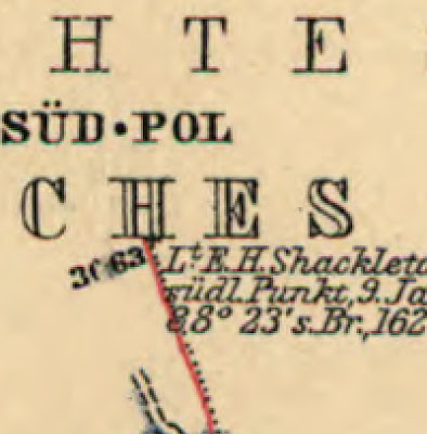
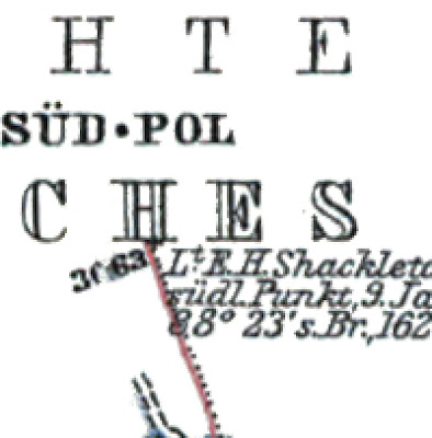
This image was cropped at 400% - the occurring greenish/reddish fringing is between 1-3 pixels. First step is to open your Raw file with Photoshop. If Camera Raw is already installed, this should be possible by double-clicking the file.
Note: If your file is not a Raw file you could nonetheless open it using Camera Raw. Here's a short how to:
Photoshop >>> File >>> Open as…
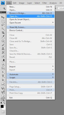
>>> [yourfile].[yourimageformat] >>>
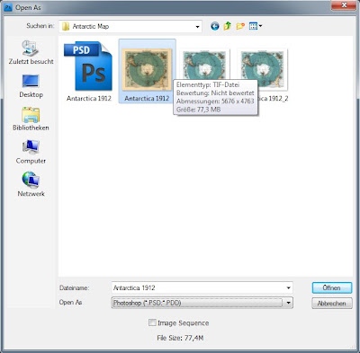
Open as: Camera Raw
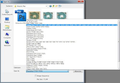
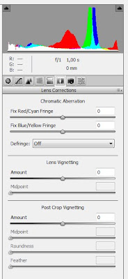 In the next step the Raw dialog should open up. The third tab from the right is “lens correction” – that’s where we will start working. The section “Chromatic Aberration” is almost self-explanatory. Depending on the colour fringing of your image you either adjust red/cyan or blue/yellow. The larger the colour fringing the easier to remove it – but don’t panic if otherwise.
In this case you could use “Defringe: All Edges” or “Defringe: Hightlight Edges“. “Defringe: All Edges” will remove the colour fringing, but also results in subtle grayish lines. For my image this solution appeared to be the optimum. The defringed image tends to be a little bit desaturated, so I recommend you to slightly increase the saturation and if needed contrast. It might be helpful to have the original layer and the adjusted layer in your layers palette to directly compare what values of saturation/contrast fit the most for your project. “Defringe: Highlight Edges” is to be used if most of the colour fringing occurs in edges of highlighting, which is quite often the case. Just feel free to play around with the sliders.
After a few hours of work including temperature, levels, curves, saturation and restoring the map the finished version looks like this:
What is chromatic aberration?
“In optics, chromatic aberration (also called achromatism or chromatic distortion) is the failure of a lens to focus all colors to the same point”, is the first sentence in the Wikipedia entry on chromatic aberration. Basically light enters a lense in the same, aligned direction but due to the mechanical advice and its imperfection – the light leaves the lense in several unaligned directions.
We should leave the technical question at this point as well. For further information I recommend the full article.
How does that affect an image?
Chromatic aberration looks like “purple fringing”. On the image below you can see longitudial chromatic aberration. In this case all edges of your subject have purple fringes. If there are additional green fringes you speak of lateral chromatic aberration. Again for further technical information I recommend reading the article on purple fringing.
The good
The most convenient solution for chromatic aberration is using Adobe's Camera Raw. For those amongst you who use Photoshop but never headed for Camera Raw here you go.
Camera Raw is freeware that enables you to work with the raw material from your DLSR. To explain the full workflow and the advantages and disadvantages of Camera Raw would be enough information for a second article – so let us focus on dealing with chromatic aberrations and purple fringing. I recently edited a map of the South Pole which had some problems.

This image was cropped at 400% - the occurring greenish/reddish fringing is between 1-3 pixels. First step is to open your Raw file with Photoshop. If Camera Raw is already installed, this should be possible by double-clicking the file.
Note: If your file is not a Raw file you could nonetheless open it using Camera Raw. Here's a short how to:
Photoshop >>> File >>> Open as…

>>> [yourfile].[yourimageformat] >>>

Open as: Camera Raw

 In the next step the Raw dialog should open up. The third tab from the right is “lens correction” – that’s where we will start working. The section “Chromatic Aberration” is almost self-explanatory. Depending on the colour fringing of your image you either adjust red/cyan or blue/yellow. The larger the colour fringing the easier to remove it – but don’t panic if otherwise.
 In this case you could use “Defringe: All Edges” or “Defringe: Hightlight Edges“. “Defringe: All Edges” will remove the colour fringing, but also results in subtle grayish lines. For my image this solution appeared to be the optimum. The defringed image tends to be a little bit desaturated, so I recommend you to slightly increase the saturation and if needed contrast. It might be helpful to have the original layer and the adjusted layer in your layers palette to directly compare what values of saturation/contrast fit the most for your project. “Defringe: Highlight Edges” is to be used if most of the colour fringing occurs in edges of highlighting, which is quite often the case. Just feel free to play around with the sliders.
After a few hours of work including temperature, levels, curves, saturation and restoring the map the finished version looks like this:

Wednesday, February 24, 2010
Writing articles for a change...and oh what a change
Strange as it may seem, I've also been known to write for Wikipedia. This last day has been more interesting than usual in that regard. You're going to love how this post ends.
Found the topic from a short mention at an administrative noticeboard.
Actual press coverage is mixed: plenty of positives, also skepticism over feasibility and hype. The company was profiled by 60 Minutes a few days ago and has been doing a media blitz since then. It's a tech firm that wants to sell green energy and is very cagey about its company secrets. They held a press conference this morning with Arnold Schwarzenegger, Colin Powell, and Michael Bloomberg. Is this pre-IPO hype?
Astroturfing jobs at Wikipedia these days are getting contracted at one or two levels of separation from the client company. So the geolocation of this major contributor is less significant than its singlemindedness. Read the edits for yourself.
http://en.wikipedia.org/w/index.php?title=Special:Contributions&limit=500&target=58.179.137.71
Following are a few highlights from the IP's attempts to reinsert promotional content into company history such as a tangential NASA connection that the CEO had prior to founding the startup:
*(the idea came from somewhere....look at the Microsoft Page....)
*(one fine day in 2001, Mr Sridhar became an expert in fuel cells!)
*(the fucking Google page says where the name Google came from!!!!! ok, bitch?)
The last of those comments looks to have been intended toward me; the IP user appears not to have noticed that by this time the IP was actually edit warring with a male administrator. This IP editor doesn't seem to understand much about the underlying engineering or science. At one point I stopped to explain that hydrolysis consumes energy rather than produces it; shortly afterward the IP shuffled sentences so it looked like a venture capitalist was using a cost per kilowatt hour argument to rebut a criticism about fuel cell manufacturing costs.
The firm has $400 million in venture capital and a burn rate of $85 million a year. Everyone loves green energy--or would if it were cost effective--but this looks like a very high stakes gamble. Bloom Energy's business plan is based upon a bet that a notoriously unstable technology can be mass produced by a startup firm headed by a Ph.D. who never got any closer to NASA than managing a university department that built prototypes. Instead of Schwarzenegger and Powell, I wish that company had introduced its VP of production at the press conference today.
It turns out that Sprint Nextel owns 15 patents on similar fuel cell technology and has been using their own models in the field for five years. The Department of Energy gave Sprint a $7 million grant last year to expand their program. Quite a few other firms are active in the area. It isn't clear what Bloom Energy has that they don't--other than a star studded board and a hype generator. It could be the start of a new era or it could be the next Pets.com.
Among the interesting tidbits I found was a piece from Wired that had located a 2009 patent award to Bloom Energy for a device that seems very similar to its Bloom Energy Server. Perhaps the vaunted "secret ingredient". Did you know...
Time to go back onsite and politely congratulate that IP coauthor. Entries at Wikipedia's "Did you know?" feature remain live about six hours. Wikipedia's main page typically receives 1 million page views during that time.
Found the topic from a short mention at an administrative noticeboard.
It appears that this article on a California company may be part of that company's pre-IPO publicity blitz. The company's website, linked from the article, shows a countdown clock for tomorrow at 9:00 am local time. Given that just a few contributors wrote most of the article over the past few days, is this cause for concern? User:LeadSongDog come howl 21:37, 23 February 2010 (UTC)The good thing about blogging is it gives the chance to be more candid. So not to mince words, this looked like astroturfing. Here's how it appeared shortly before my first edit. Red flags for promotional writing include awards in the lead and a single sentence of criticism backloaded at the tail end of the article. The section entitled "Competition" used one source that basically stated the major players had recently pulled out of the field. If you check the references the quotes turn out to be cherry picked.
Actual press coverage is mixed: plenty of positives, also skepticism over feasibility and hype. The company was profiled by 60 Minutes a few days ago and has been doing a media blitz since then. It's a tech firm that wants to sell green energy and is very cagey about its company secrets. They held a press conference this morning with Arnold Schwarzenegger, Colin Powell, and Michael Bloomberg. Is this pre-IPO hype?
Astroturfing jobs at Wikipedia these days are getting contracted at one or two levels of separation from the client company. So the geolocation of this major contributor is less significant than its singlemindedness. Read the edits for yourself.
http://en.wikipedia.org/w/index.php?title=Special:Contributions&limit=500&target=58.179.137.71
Following are a few highlights from the IP's attempts to reinsert promotional content into company history such as a tangential NASA connection that the CEO had prior to founding the startup:
*(the idea came from somewhere....look at the Microsoft Page....)
*(one fine day in 2001, Mr Sridhar became an expert in fuel cells!)
*(the fucking Google page says where the name Google came from!!!!! ok, bitch?)
The last of those comments looks to have been intended toward me; the IP user appears not to have noticed that by this time the IP was actually edit warring with a male administrator. This IP editor doesn't seem to understand much about the underlying engineering or science. At one point I stopped to explain that hydrolysis consumes energy rather than produces it; shortly afterward the IP shuffled sentences so it looked like a venture capitalist was using a cost per kilowatt hour argument to rebut a criticism about fuel cell manufacturing costs.
The firm has $400 million in venture capital and a burn rate of $85 million a year. Everyone loves green energy--or would if it were cost effective--but this looks like a very high stakes gamble. Bloom Energy's business plan is based upon a bet that a notoriously unstable technology can be mass produced by a startup firm headed by a Ph.D. who never got any closer to NASA than managing a university department that built prototypes. Instead of Schwarzenegger and Powell, I wish that company had introduced its VP of production at the press conference today.
It turns out that Sprint Nextel owns 15 patents on similar fuel cell technology and has been using their own models in the field for five years. The Department of Energy gave Sprint a $7 million grant last year to expand their program. Quite a few other firms are active in the area. It isn't clear what Bloom Energy has that they don't--other than a star studded board and a hype generator. It could be the start of a new era or it could be the next Pets.com.
Among the interesting tidbits I found was a piece from Wired that had located a 2009 patent award to Bloom Energy for a device that seems very similar to its Bloom Energy Server. Perhaps the vaunted "secret ingredient". Did you know...
... that Bloom Energy was awarded a patent in 2009 for a power device that utilizes yttria-stabilized zirconia?That lovely bit of information is on Wikipedia's main page right now.
Time to go back onsite and politely congratulate that IP coauthor. Entries at Wikipedia's "Did you know?" feature remain live about six hours. Wikipedia's main page typically receives 1 million page views during that time.
Saturday, February 06, 2010
Lead room

To see what a difference the lead room makes, let's try cropping out part of the photograph so he looks centered. The effect isn't nearly so pleasing.

Human beings take cues from the eyes of other people. We want to know what catches their attention; there's an urge to glance in the same direction. Even when we know that we're looking at a very old portrait we feel that urge; it's instinctive. And although this subject's expression is exactly the same the cropped version seems caged; we glean less from it. The slouch and the knitted brow don't convey as much.
Last night the concept of lead room intruded on a search for historic Irish portraits that Alison and I were doing. She wanted Countess Markiewicz and we found a 12 MB portrait that was feasible but not ideal.

This doesn't have Ben Shahn's artistry and the lead room is on the wrong side. Plus the image has more damage at right than at left. There isn't much room to crop in any direction and the crop I want to make out of sheer laziness would get rid of that bright vertical band. But then we would lose precious lead room and this photograph doesn't have enough of it anyway.
It only takes a moment to perform a crop, but the decisions that go into it mean a great deal. Historic material sometimes carries unavoidable flaws. Alison was willing to work with this anyway; Countess Markiewicz was the first woman in Europe to hold a cabinet minister position in a national government; she was Minister of Labor for Ireland from 1919-1922 (Alison might want to throttle me for not spelling that L-a-b-o-u-r but I'm an ignorant Yank).
She's doing most of the work herself. I offered to crop. There's no really good choice here and a lot of bad ones.

I wanted to crop away at left to balance the lead room but couldn't really go very far: her long skirt, the andirons, her fingers, and the books on the mantel all got in the way. So I left a lot of the bright vertical band at far right. It's a correctable problem. Alison will need extra work to fix it--and somehow I suspect I may be helping with those touches. But the result will be worth it.
For comparison here's a "lazy editor's crop" alternate. Less work to restore but it would never be as good.

So cheers to Alison! (And now, since I'm such an evil wiki witch, she'll just have to do this restoration so you can all read the followup. Excuse me while I drop another newt into the cauldron...)
Subscribe to:
Posts (Atom)

 Posts
Posts


