Showing posts with label Wikipedia featured pictures. Show all posts

Sunday, June 21, 2009

Honoring Iran

Here's an option if you want to contribute something positive with regard to Iran: help spread appreciation of Iranian history and culture.

At right is a featured picture that appears at the biography of Nezami Ganjavi, who was the greatest romantic epic poet in Persian literature. It illustrates his version of the Layla and Majnun love story.

The Library of Congress hosts hundreds of high resolution scans of calligraphy, and the largest portion of the collection originates from Iran. For selections, see here. They're all public domain, which means they're available for upload and placement at Wikipedia. With restoration, some of these could qualify for featured picture designation. A few of the images from the calligraphy collection are already in use, but many aren't.

By uploading images to Wikimedia Commons, you can make this material available to the various language editions of Wikipedia. With a surf through Google Books you can expand the articles they'll illustrate.

Saturday, June 06, 2009

Why featured pictures is ailing

Reposted from Wikipedia's featured pictures talk page:

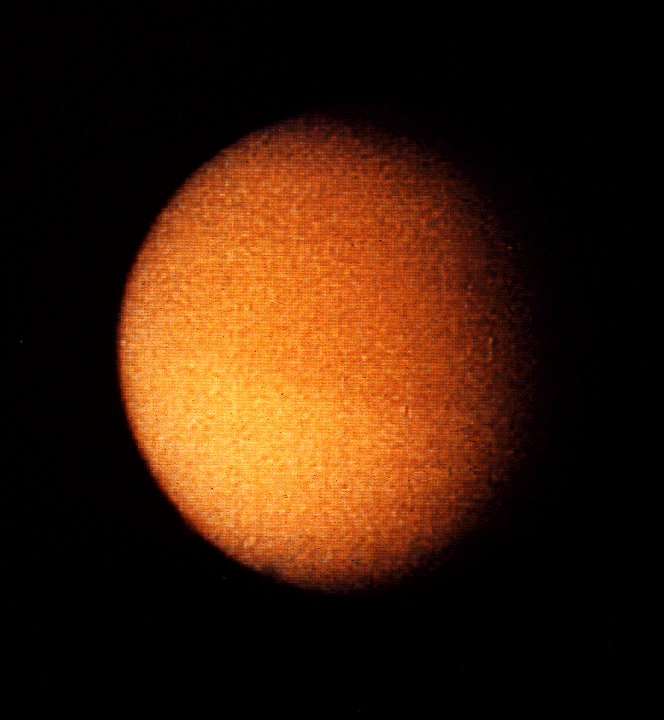
Picking up on the 'crap technical quality' comment in the thread above,[21] a problem in recent months has been myopic understanding of technical quality. One of the best examples to diagnose the ailment is the Titan delisting nomination.

The image is dated 2004, but of course the camera wasn't made in 2004 because the spacecraft was launched in 1997. The exact mass of all the equipment had to be known and tested years before launch in order to plot its course, which included two gravity assist flybys at Venus and Jupiter. So the camera was built with early 1990s technology. It had to perform at temperatures a few degrees above absolute zero in near-total darkness because at Saturn's orbit the sun doesn't provide much more energy than a bright star.

Titan has been visited by spacecraft only three times in human history. The first was Pioneer 11 in 1973, which returned this image. Then the Voyager missions in 1980-1981 shot this. And in order to even do that well with the technology that existed at the time, NASA scheduled Voyager I's final encounter as a close Titan flyby.

The technical challenges that arise after launch add additional layers of difficulty to these missions. Voyager I was nearly destroyed in the rings of Saturn before its Titan encounter because the best technology available when the mission was planned had been unable to detect any matter in the dark zones of its ring system. After the Jupiter encounter the craft sent back images of literally hundreds of rings in the zone of its planned course: a grain of sand would have operated like a bullet on the craft at the speeds it was traveling. Emergency course modifications were extremely difficult to execute, but the mission was saved. Without that rescue, much of the data never would have been obtained that went into planning the Cassini mission.

This is all cutting edge science and sometimes the technical team has to work around hardware failures. One famous save occurred here:

Since Galileo's high-gain antenna failed to open in 1991 the mission was forced to use the low-gain antenna for all communication to Earth. This meant that data storage to Galileo's tape recorder for later compression and playback was absolutely crucial in order to obtain any substantial information from the planned Jupiter and moon flybys. In October 1995, Galileo's 114 megabyte (914,489,344 bits[40]), four-track digital tape recorder which was manufactured by Odetics Corporation, remained stuck in rewind mode for 15 hours before engineers learned what happened and sent commands to shut it off, after recording an image of Jupiter. Though the recorder itself was still in working order the malfunction possibly damaged a length of tape at the end of the reel. This section of tape was subsequently declared "off limits" to any future data recording and was covered with 25 more turns of tape to secure the section and reduce any further stresses, which could tear it.

The software needed extensive rewrites after the antenna failure, then a second round of even more drastic rewrites after the tape recorder failure. And all of the relevant imaging had to be rescheduled and replanned because the data was moving much more slowly, but the craft was still flying at orbital speed.

It simply isn't rational to review the Titan image by the same standards one would apply to a home tripod photo of earth's moon. Of course the Titan mosaic isn't stitched: it was shot for scientific purposes, not for an art gallery. Of course it's contrasty: Titan is the only astronomical body in the solar system other than earth that has liquid at its surface--they were looking for specular reflections.

As stated before, I do have a conflict of interest regarding the Titan image and will disclose fully to anyone who emails a request. So far, no one from the featured pictures program has inquired. Most of the statements in this post are readily verifiable; a few aren't. A barnstar to the first person who detects which information wasn't published officially. Several of the regulars at featured picture candidates need to spend more time reading the articles these images illustrate.

And yet 'crap technical quality' is a comment that gets taken seriously. And the delisting nominator himself hasn't been called to task for saying FPC is not an image gallery and nobody puts quality ahead of EV. Just take a look at the page now and see for yourself. The images that are being opposed because of quality concerns have TERRIBLE quality.(original poster's emphasis)[22] That is an expression of misplaced priorities, superficial understanding, and distorted perspective. Knowledge of digital photography is not a substitute for research. The technical quality of this image is a feat of international science and engineering, and those who deny that reveal their own ignorance. It will likely be a quarter century before better images can be taken of this astronomical object. Those are the realities of science, and this website is an encyclopedia. Cross posting to my blog. DurovaCharge! 21:18, 6 June 2009 (UTC)

Sunday, March 15, 2009

Wikipedia's most viewed featured picture?

In chat with another Wikipedian last night about the Wright Brothers' first flight and interesting question came up: what is Wikipedia's most frequently viewed featured picture? In terms of ordinary monthly traffic that would probably be a featured picture for one of the site's most frequently viewed pages. Based upon a recollection of somewhat out of date statistics I guessed that would be the featured picture of Barack Obama. Further research led to a surprising discovery and inadvertently sparked a small edit war.

A later check confirmed that Barack Obama received 1,644,252 in February 2009. That makes the article Wikipedia's twenty-second most visted page for that month.

Yet it also turned out the Obama biography didn't use the featured picture of Barack Obama. This was odd. A featured picture doesn't need to occupy the lead position, of course, but it usually appears somewhere on the article where it is most relevant. On rare occasions a featured picture gets removed from its primary article through the well-meaning effort of an editor who doesn't have much experience with image use. Normally that's simple to remedy: just reinstate the image with an edit summary explaining that it's featured.

It would be an uncontroversial and straightforward edit at any other article, but what about at this location? Usually I avoid hot potato topics in mainspace. But what the heck? I thought, The election is over. I'll start a thread at the talk page, to be on the safe side. A lot of disagreement followed. When it appeared that an editor hadn't understood the reason for discussing the image I provided two explanations, then made one edit to demonstrate. Perhaps that was too bold under the circumstances, because this followed:
Yikes. Well, in order to keep things bipartisan I'll be uploading a speech by George H.W. Bush and nominating it for featured sound. Also located a public domain photo of John McCain taken shortly after his release from a POW camp.

Friday, February 20, 2009

Failure to thumbnail

This is a featured picture on English Wikipedia. But you can't see it because the Wikimedia Foundation software has a problem. The problem is a longstanding one because it's been replaced at the article about sumo wrestling with a non-featured image. And that neglect does not demonstrate respect for the volunteer Victor Rocha who did the restoration work.

In order to see this featured picture, it's necessary to go to the hosting page and click on the link where the thumbnail ought to be. So I did a check on how many people are actually viewing this page. Turns out that for the month of January 2009, the hosting page at English Wikipedia received only 50 page views, and the corresponding hosting page at Wikimedia Commons received only 56 views. So at most--if every one of those views represents a a unique hit and every one of those visitors clicked through to the full version--106 people set eyes on one of the site's best images. And we can be pretty darn sure the actual number was lower.

It's time to prioritize the proper display of images. I'm not certain what bug caused the sumo failure, since it's a JPEG image and JPEGs normally display, but WMF software consistently fails to display PNG images larger than 12.5 MB. What you get instead is this at right, which ought to look like an eighteenth century engraving of American Revolutionary War sea captain John Paul Jones. He cuts a dashing figure topside on the deck of a warship in battle--or he would if you could see him. Since WMF software doesn't accept TIFF files, we're stuck with PNGs if we want to upload uncompressed formats. This is a serious detriment to utility and to collaborative editing, and editors who live in parts of the world that have slow Internet access are effectively shut off by this bug.

These problems inhibit the use and creation of featured content.

For shame.

Tuesday, February 17, 2009

How standards change

Next month marks the fifth anniversary of Wikipedia's featured picture program. So to commemorate that occasion here's a quick look back at the beginning to see how far things have come. The bridge above was Wikipedia's first featured picture. Here was the discussion:

From Tamar Bridge and Royal Albert Bridge. I uploaded this image so I've put it in self-nominations, but it was taken by a non-wikipedian.
  • Nominated by fabiform | talk 14:55, 1 Mar 2004 (UTC)
  • Triffic!! (take that as a second) - Gaz 16:34, 1 Mar 2004 (UTC)
  • Approve. I've never seen a panorama that inclusive. Bevo 17:43, 1 Mar 2004 (UTC)
  • I heartilly approve, I've never seen anything like that... Sam Spade 05:16, 2 Mar 2004 (UTC)
Two years later, its delisting discussion:

Too distorted, blown highlights.

  • Delist. - KFP (talk | contribs) 23:48, 17 October 2006 (UTC)
  • Delist per nom. howcheng {chat} 22:17, 18 October 2006 (UTC)
  • Delist per nom. --Steven 01:11, 19 October 2006 (UTC)
  • Keep. A pity to delist this picture inspite of blown highlights. I don't think distortion is a problem, it reminds me of a M. C. Escher painting! -- Alvesgaspar 11:18, 19 October 2006 (UTC)
  • Delist I always wondered how that got to be a featured picture in the first place. | AndonicO Talk 18:16, 20 October 2006 (UTC)
  • Delist - how did this get through the first time? Yeuch. —Vanderdeckenξφ 10:45, 22 October 2006 (UTC)
  • Keep the Earth revolves around a sun. Deal with it. drumguy8800 C T 01:11, 24 October 2006 (UTC)
  • What does the earth revolving around the sun have to do with it? HighInBC (Need help? Ask me) 01:12, 24 October 2006 (UTC)
  • Delist Per blown highlights and distortion. HighInBC (Need help? Ask me) 01:12, 24 October 2006 (UTC)`
  • Delist per nominator. -- Moondigger 21:37, 24 October 2006 (UTC)
  • Question Are the bridges actually curved like this in reality? -Arad 22:22, 24 October 2006 (UTC)
Not nearly to this extreme, although the approach to the Brunnel bridge is quite curved.Laïka 22:31, 24 October 2006 (UTC)
  • Delist; confusing. Laïka 22:31, 24 October 2006 (UTC)
  • Delist per nom. Yuck. -- CountdownCrispy ( ? 22:33, 24 October 2006 (UTC)
  • Question wheres the original nom? -- Coasttocoast 23:29, 24 October 2006 (UTC)
Here. --KFP (talk | contribs) 23:33, 24 October 2006 (UTC)
Thanks, lol it seems that every picture there has been delisted :D -- Coasttocoast 00:04, 25 October 2006 (UTC)
Delisted. --KFP (talk | contribs) 23:42, 26 October 2006 (UTC)

Wikipedia saw 23 nominations during the featured picture program's first month, of which 14 were promoted. 11 of those have since been delisted. While reviewing the remaining 3 I noticed one that really wasn't up to current standards and nominated that for delisting also. It's a dust storm in Texas, but at 700 x 459 pixels and 68KB it just doesn't meet the minimum expectations.

For comparison, here's the discussion for one of last month's featured candidates: a shot of the harbor at Sydney, Australia. without its famous bridge:

Sydney Skyline at dusk

Original - Sydney's skyline as viewed south across the harbour from Kirribilli at dusk. The Sydney Opera House is visible on the far left.
Reason
Shows the skyline of Sydney in an encyclopaedic and visually pleasing way. It is currently the lead image in the Sydney article.
Articles this image appears in
Sydney
Creator
User:Diliff
  • Support as nominator --Diliff | (Talk) (Contribs) 21:53, 8 January 2009 (UTC)
  • Comment I have to say that it is a nice image, but it would be good form to wait until the active discussion about the choice of top image has formed a consensus, especially as there has been talk about EV. Your image has only in fact been in the article for 24 hours. (I disclose that the previous image in the article was mine, it as been there for some time. Yours is a far better image photographically, I am not offended by it being replaced - mine was no more than a quick shot taken from a ferry that I thought would be useful to WP so I uploaded it, i am not proud of it at all.) But it feels a bit off to self nominate yours for FP at this point, especially in light of recent discussions about self nomination and the length of time images have actually been in the host article. Mfield (talk) 22:20, 8 January 2009 (UTC)
    • Well, fair enough. There didn't seem to actually be any discussion on the image on the talk page. The person who initially seemed against the image admitted they preferred the replacement once they saw it in the infobox and there was no other discussion since then. I'm happy to mothball the nomination for a while if desired. To be honest though, the EV of the image as a definitive skyline of Sydney in the article is clear. Even if it were decided to keep your image as the lead image, I'm fairly certain it would, as I mentioned on the Sydney talk page, be a good candidate to replace the skyline as viewed from Balmain further down the article. I wouldn't have nominated the image if I didn't think it stood a good chance of sticking there. As we discussed about self-noms and time periods, I thought we basically agreed that while it is generally safer to wait to confirm EV, there is no mandate for it and we should judge each case individually. As I said above, I don't think there could be much argument on the basis of EV. Diliff | (Talk) (Contribs) 22:32, 8 January 2009 (UTC)
  • Comment I don't see the appropriateness of having this picture in the economy section of the Sydney article. For one it is not supported by text, none of the buildings mentioned in the text can be seen in the image and its features are to small. I also think that the previous image would be more suitable for the info box. Perhaps this would be more suited in the tourism section replacing the opera house pic and Just because it is a featured photo (soon) doesn't make it appropriate for that section. The photo that I have added to that section is supported by text and some of the institutions and a lot of the subject matter can clearly be seen in it. Adam (talk) 02:34, 9 January 2009 (UTC)
    • What makes you think the previous image is better in the infobox? Also, I concede that this image doesn't show the logos on the buildings as well as the Balmain image, but it is a far more complete skyline of Sydney. I don't know if I would say that the text of the section relates to the buildings visible in the Balmain image. The only one I can see is Westpac, and the caption makes no mention of the economy. Anyway, I think if you want to discuss it further, we'd best take it to a talk page as this is getting beyond the reaches of the nomination. For disclosure, both Adam J.W.C. and Mfield are the authors of two images that this image has replaced or has been suggested to replace, respectively. Diliff | (Talk) (Contribs) 02:59, 9 January 2009 (UTC)
      • I have already disclosed that if you'd care to have read my original comment, I have no bone to pick with the image being replaced, I have an issue with an image being proposed for FP whilst a discussion is still underway as to whether it should even be included in the only article it is now in. Mfield (talk) 03:30, 9 January 2009 (UTC)
        • I know you did, and I did read your original comment. It was just a summary of disclosure regarding both you and Adam together. No need to get narky - it wasn't an attempt to undermine your disclosure.. As I said though, there actually was no discussion underway at the time I submitted this. The only objection raised on the Sydney talk page was withdrawn. Diliff | (Talk) (Contribs) 13:24, 9 January 2009 (UTC)

Comment I'm supportive of the image, but I tend to agree there should not be ongoing dispute about it among contributors to the article (either here or on the talk page). Hard to assess its EV until we know it is going to be stable in the article. Tentatively I favor it for the infobox rather than the Economy section, as the Balmain image places the emphasis on the financial/corporate landscape; a broad overview of Sydney's skyline is less useful there. Fletcher (talk) 04:07, 9 January 2009 (UTC)

  • To be fair, there actually wasn't a dispute on the article's talk page at the time I submitted this. I raised the issue on the talk page prior to adding it to the article, and one person had initial reservations about it, but when another contributor added it to the article of his own accord, they rescinded their objections and supported its inclusion. For all of the debate here, as far as I can tell Adam J.W.C is the only person who objects to the image in the article. Diliff | (Talk) (Contribs) 13:20, 9 January 2009 (UTC)
  • Weak Oppose While visually it's pretty much perfect for a city nightscape, I'd have like the composition to also include the harbour bridge as in this pano you previously took. --Fir0002 04:08, 9 January 2009 (UTC)
    • Wouldn't it be an almost identical picture to that previous one, then? :-) I actually intended to take the same shot as the previous FP when I was in Sydney, but because of the NYE fireworks, they had begun to scaffold the bridge up and it looked pretty awful so I delibrately excluded the bridge. I can appreciate that you might want a slightly different composition, but given that I cannot simply go back and re-shoot (I've been back in the UK for a month now), this is the image I managed to take. Are you opposing because you wish it were different, or are you opposing because it is really unsuitable to be an FP in its current form? Diliff | (Talk) (Contribs) 11:52, 9 January 2009 (UTC)
      • Well I took it as a HDR upgrade to your existing one :) While I very much appreciate this being very difficult for you to redo, I do think that the bridge should be part of a lead panorama of Sydney as it's such an iconic part of that city (and at any other time of the year including it would have made perfect sense). So for that reason I think your existing FP has greater EV and thus I couldn't support this one nice as it is. --Fir0002 10:35, 10 January 2009 (UTC)
        • I think the existing FP has a different purpose though - this image is suitable for the infobox and the existing FP works well as a panorama at the bottom. Yes, it would have been nice to include the bridge, but if I did, it wouldn't make a good thumbnail for the infobox and therefore would merely have been a candidate to replace the existing FP, rather than complement it. Besides, as Durova mentioned, not every image of New York City needs the Brooklyn Bridge. It is very difficult to get photo with a good composition, with non-panoramic proportions and the Opera House, skyline and the Harbour Bridge all in the frame. As an analogy, you already have a good FP of a kangaroo but you've nominated a new one with different characteristics. Some things about the new one are better (no man made elements in the background, shows feeding) but some things are worse (angle, less aesthetically pleasing composition/pose), but because it describes a slightly different aspect of the same subject, you thought it worth nominating. Same situation here IMO. This image wouldn't be fit for purpose if it included the bridge. Diliff | (Talk) (Contribs) 11:52, 10 January 2009 (UTC)
          • I've never been to Sydney but is it possible to shoot from an angle similar to this? That would be one way to get the bridge and the opera house whilst retaining acceptable dimensions for the lead image. If it's not possible then I'll change my vote to Neutral because I can understand what you're saying with them illustrating different aspects. But just to let you know that other FPC wasn't actually successful so I haven't yet got a kangaroo FP :) --Fir0002 22:12, 10 January 2009 (UTC)
            • Oh really? I was sure that last one went through.. Okay, nevermind, but you got my point at least! As for that image, well it might be possible. Sydney is a massive city with lots of coastline, but quite often it is difficult to get a good shot from public property, as all the good vantage points are obscured by multi-million dollar houses on the harbour. :-) Anyway, you can't actually see the skyline in it, so it may be cut off by other houses, I'm really not sure. It would take a lot of exploring to find the hidden gem shooting locations, I'd say. And as I said to Mfield below, some of them require access to people's balconies! As a mere tourist with limited scouting time, I was more limited to where the ferries happened to take me! Even this shot required a 10 minute walk through residential streets from the nearest ferry stop, or else a 20 minute hike across the Harbour Bridge and then down a few side streets. You sort of have to know what you're doing, to cut a long story short! Diliff | (Talk) (Contribs) 23:55, 10 January 2009 (UTC)
            • On that note, I am waiting until next time to shoot one from here[10] (or better yet of possible from the land in the lower half of the frame) as it gives a nice broad view. Mfield (talk) 22:53, 10 January 2009 (UTC)
              • That actually looks like a good spot to shoot from. Sydney is blessed with so much harbour that there is practically an unlimited number of good locations to shoot from (if you can get access to the shoreline, a decent vantage point or in an ideal world, a friendly resident with a balcony!), although I think that would probably also result in a panoramic composition. I can't quite tell from a map exactly where it was shot from. That little peninsula is either Cremorne Point or Taronga (from what I can see from Google Maps). Actually given the title of the image (given it is on your site, did you take it? If so, why are you waiting until next time to reshoot it?), it must be from Taronga. The ferries go to both locations so it would be worth the trip. I'd be very interested to see what you can shoot from there. Diliff | (Talk) (Contribs) 23:55, 10 January 2009 (UTC)
                • Yes I took it and that one is shot from the zoo, but it's a crop from a two frame handheld pano that I shot a few years back when we jumped on the ferry to go there for the afternoon with some friends and i just had the camera on my shoulder. No tripod and only the one lens. I have meant to get over there at dawn last time i was in Sydney to shoot it properly but had no time. Mfield (talk) 00:11, 11 January 2009 (UTC)
  • Comment I think this image would be appropriate for the lead image in the Tourism in Sydney article instead of the Opera House image and in the same section in the Sydney article. Also I am not sure if this image looks natural especially the colour of the Sky. If I were there at that time would it look exactly like that. I wouldn't mind seeing a version of this image that hasn't been tone blended. Adam (talk) 06:43, 9 January 2009 (UTC)
    • A couple of things.. I agree it could work in the tourism article, but I actually think that if it were to, the Opera House picture should probably be moved to replace your image from Balmain in it too. I'm not saying that to spite you, I'm saying it because it is actually located right in the middle of the Sydney Opera House section! ;-) As for the colour of the sky, the sky can and does turn pinky purply just after sunset. It doesn't happen at every sunset, but it does happen. It has been enhanced slightly with a minor saturation boost and contrast enhancement, but I maintain it does still look natural. Besides, would your image of the Blue Mountains look like this if I were there? Diliff | (Talk) (Contribs) 11:52, 9 January 2009 (UTC)
        • It would look like this if you were there. Also I never objected to the image being in the Sydney article but I did suggest that it would be good for the tourism section, but I admit that that it does look good in the info box as well. As for the tourism article (in Syd) I think all images would be appropriate as they all show Sydney from different perspectives. Adam (talk) 22:02, 9 January 2009 (UTC)
  • Strong support This picture is a great composition and shows a very impressive view of Sydney. Wladyslaw (talk) 08:10, 9 January 2009 (UTC)
  • Support--Mbz1 (talk) 16:17, 9 January 2009 (UTC)
  • Support Good quality, aesthetically pleasing. IMO adding the harbour bridge would probably make the image lose its appeal as seen in thumbnail in the article. Muhammad(talk) 16:49, 9 January 2009 (UTC)
    • I agree. I think it would also make the proportions of the image too extreme for the infobox. Diliff | (Talk) (Contribs) 17:29, 9 January 2009 (UTC)
  • Support excellent composition. No comment on the harbor bridge dispute--looks fine to a silly Yank from the other side of the world. Not every panorama of NYC needs the Brooklyn Bridge and/or Statue of Liberty. The possibility of different vistas adds character to a city. DurovaCharge! 17:49, 9 January 2009 (UTC)
  • Support I said above I was supportive of the image so I should give an official !vote. I think it is definitely a great image for the article, and whatever its final placement, I agree no one seems to be trying to get rid of it. Fletcher (talk) 00:26, 10 January 2009 (UTC)
  • Support Though I wonder if there isn't a larger resolution available. The colors in the sky are very impressive! --Massimo Catarinella (talk) 01:01, 12 January 2009 (UTC)
  • Support - really good.--Avala (talk) 20:41, 12 January 2009 (UTC)

Promoted File:Sydney skyline at dusk - Dec 2008.jpg --Wronkiew (talk) 04:25, 17 January 2009 (UTC)

I'm on the fence about one of those other first month promotions--a map of the Philippines--but the third remaining example of our original featured pictures holds up pretty well. It's since been featured at Commons and at the German Wikipedia: an overhead view of the USS Iowa firing its guns.

Anchors aweigh.

Sunday, February 15, 2009

Wikipedia Art and media restoration

Wikipedia had one of its more interesting deletion discussions overnight.  A page called Wikipedia Art lasted about a day. By site standards the deletion was mundane, but the editors who created it were not. There's an untapped opportunity here and I'm reaching out to them. The artists Scott Kildall, Nathaniel Stern, and Brian Sherwin were active in it, apparently with a measure of support from the academic art world.

There are untapped synergies between Wikipedia and professional artists. One of them is illustrated here: a portrait of actor Mark Harmon by professional photographer Jerry Avenaim. This photo is scheduled to run on Wikipedia's main page tomorrow.

Mr. Avenaim himself didn't nominate the portrait for featured picture. Another volunteer noticed its high quality and put it up as a candidate where it nearly failed the minimum resolution requirements until I noticed the photographer was already an active Wikipedian and contacted him. He was surprised and delighted to learn his work was under consideration, and supplied a larger version.

Now here's good news for Jerry Avenaim: as Picture of the Day for February 17, 2009 the portrait will receive an estimated 6 to 7 million page views as a main feature, plus about 30,000 direct views to the image hosting page. That's more attention than his work would get from a day on the front page of The New York Times. Thank you, Jerry Avenaim, for doing well by doing good. Here's a link to his blog.

I would love to establish contact with the Wikipedia Art participants and help them direct their considerable talents into productive endeavors. Posted to the Village Pump discussion about this. Let's hope it yields fruitful results.

Friday, February 06, 2009

A milestone

Last night I reached 200 featured credits. Three featured picture candidates at English Wikipedia got promoted, bringing the total to 201.

Number two hundred was the Wounded Knee aftermath. Currently I am corresponding with the staff at the Library of Congress about the find: restoration revealed four human bodies in the foreground which had been not been mentioned in bibliographic notes and were nearly invisible in the faded original print. Am looking to make contact with a historian who specializes in the area.

Monday, January 26, 2009

A slide show


Found this rather interesting gadget on another blog. Decided to load a few featured pictures and give it a spin.

Tuesday, January 13, 2009

Darwin Day

The other day Ragesoss showed up at my user talk with a reminder that Darwin Day happens next month: the two hundredth anniversary of Charles Darwin's birth. Could we have a featured picture for the occasion?

I'm a sucker for that kind of request.

When it comes to online image archives for that kind of purpose, the Library of Congress website has everybody else beat hands down. Site architecture is chaotic, things can be hit or miss, but when they get it right they really get it right in a way nobody else does. Because what's needed for this kind of endeavor is a hefty TIFF file made from a well-curated original on a really good clean scanner.

A lot of people who don't do restoration come along with an 80K file and expect something to be accomplished with it. Sorry: I can't restore information that isn't there. 2MB is about the minimum, and that's pushing it. 10MB is more like it. I don't call a file large until it's at least 100MB, and one of the images in my current workpile is over half a gigabyte.

The Library of Congress knows how to create and host this sort of material. Also wonderful: they don't try to claim proprietary control over information that's in the public domain (a surprising number of museums and archives do assert such claims, but that's a story for a different day). So after trotting over to the photographs collection and running a search, a serviceable rotograph turns up at a decent 23MB. Here's the page. Not the most famous likeness, but the technical quality is far better than is likely available anywhere else.

Five or so hours later the restoration was complete. Practice makes this sort of work go quickly. The full sized restoration is a nearly 5MB JPEG file (Wikimedia software doesn't allow for TIFF uploads) and available here. It's enjoyable to be able to help out in an event as important as Darwin Day.

Yet it's a shame that for such an iconic figure of British science, the best source for a portrait is a foreign archive. Surely British archives have better quality original images. This is their heritage, their history. I wish more countries brought their collections into the digital age the way the Library of Congress has been doing.

Saturday, January 10, 2009

Heartbreakers

With the new year and more people searching for historic images, it's time to write up a bit of how this works. Basically there are two ways to get started:

Easy:
Tug on the sleeve of somebody who has more material than time to restore it.

Hard:
Go looking for material yourself.

Most of the newcomers seem to prefer the hard way so here are a few words from experience.

Overall, only about 1 in 1000 archival images has the right technical parameters to consider for featured picture candidacy. Many of the others may be encyclopedic or interesting, and worth using at Wikipedia. It's a lot of work getting one image restored so I usually focus on material that has the potential to go all the way. Yesterday I blogged about Toni Frissell's portrait of Tuskegee Airman Capt. Edward M. Thomas. These are a few of the things I wanted to use along the way to locating that portrait.

The first of several attempts was Booker T. Washington. I had recently restored a portrait of George Washington Carver, who had been a contemporary of Booker T. Washington at Tuskegee Institute. That prompted the thought that maybe we could get a featured picture pair. Unfortunately that idea didn't turn out well. Ran into problems like the one above: it's available in a 25MB version, but it's too heavily damaged across the face to really work with.

He must have been a superb public speaker. The Library of Congress has several images of Washington speaking outdoors to crowds, and in every one of him both he and the audience look very engaged. Again--and I call these things heartbreakers--the only one that's available in a reasonable 12MB resolution is one of the weakest of these. The postures of the men near the steps are priceless: the nearest ones leaning forward, mouths open in laughter, while others farther away fold their arms or scratch their chins skeptically. Unfortunately the uneven fade on this image means Washington's face itself is barely visible, the lower right corner is lost, and a partial figure in the left foreground distracts from the composition. There's simply no way to crop the problems out.

These are images I'd love to see in higher resolution, but they aren't available online any larger than this. One lists the location as New Orleans; another, Mississippi; the last one is captioned 'I want our people to have homes.' Wikipedia has one clip of him speaking. You can hear his voice here.

What's frustrating is to get this close to something--so close I can almost hear the cicadas of a sticky Gulf Coast afternoon--and miss the shot. I could restore his home or his wife (although neither would be quite good enough for featured picture either even if they had as much encyclopedic value). Wikipedians who notice my image work usually see only the successes, but this is a glimpse of what's behind that. A whole lot of searching; a whole lot of things that are nearly good enough but just won't fly; a whole lot of material that has the encyclopedic value but not the right technicals.

There's nothing to be done but get used to it and keep on looking. Sometimes you can write and request a better version, but most of the people you'll communicate with don't understand the technicals and the new file--if you get it--may still be unusable. The gems are out there too, and when one finally turns up it's worth all the effort.

And thanks to Moni3, who's working hard to get started, for inspiring today's post.

Thursday, January 08, 2009

Quoth the image: "Nevermore?"

Interesting how the digital age has altered encyclopedias. During the 1990s--when Encarta was in its heyday--publishers oriented toward expanding media content rather than scope: it's expensive to use color illustrations in a paper and ink publication, but that cost drops with digitization and new options become possible: sound and video. Where Wikipedia innovated (aside from its open edit structure) was in terms of scope: the economics of dead trees publishing had kept encyclopedias to a certain size. Encarta's premium edition is barely over 60,000 articles. Wikipedia kept adding more articles. Things have come full circle, though, and Wikipedians turned to devaluing media.

A recent example was the featured article candidacy for the biography of United States President Benjamin Harrison. Awadewit reviews featured article candidate images for copyright compliance (bless her for that) and suggested I might find a portrait to restore for featured picture candidacy. So I toddled over to the Library of Congress website where the first charming thing that caught my eye was a caricature from Puck. Lovely, but a bit small even at full size for consideration. Unfortunately none of the formal photographs had the right technical parameters for featured picture consideration, but three lithographs did. Awadewit suggested putting the selection to the article's editors. So I posted to the article talk page. Any one of the three would be an enormous undertaking--they're all over 200MB. And with featured article candidacy underway, editors are at their most eager for any improvement to a page.

How much response did that offer bring? Not one murmur for six days, until an IP weighed in. Thank you, IP editor. To the rest I don't know what to say.

Let's face facts: when people browse Wikipedia they don't skim to the third section and look for brilliant copyediting. They notice the lead image and the caption. If the media elements are interesting they're more likely to stay and read the rest.

I've also located an audio file of Lyndon Johnson's speech when he signed the Civil Rights Act of 1964. In light of this month's events it seems fitting to nominate it for featured sound. The candidacy should go live soon.

Fortunately this year's WikiCup has brought new interest in featured pictures and featured sounds. So might as well announce this openly: winning ain't everything. It ain't even that important. But getting more restorationists is. I've been passing out suitable material to about half a dozen participants and would gladly help more, including follow-up with technical assistance. Shoemaker's Holiday, who restores using different software, is glad to assist new restorationists also.

If we had 100 restorationists each doing 2 restorations a week, Wikipedia could gain 10,000 featured pictures in one year.

Which would be really cool for the project. And would be a lot of help to a lot of smaller language editions of Wikipedia. When you consider that over 180 language editions don't even have 10,000 articles yet, good media content can be quite a boost. It's far easier to translate a caption than to translate a full article.

And in the longer term we're looking to gain access to more national libraries and archives. We want to restore the world's history, not just Benjamin Harrison.