
Wonderful news from the Wikimedia Technical Blog today: Wikimedia Germany is developing full TIFF support for Wikimedia Commons with implementation scheduled for November.
Earlier this year the WMF developers enabled TIFF uploads to Commons for the first time, mostly at the request of the growing restoration community. TIFF is a file format that's widely used for many real world applications including archival digitization, but most web browsers do not display it and WMF software is unable to render it. The new development will make WMF more TIFF-friendly.
TIFF support facilitates file uploads directly from museums, libraries, and other cultural institutions. It also aids wiki-style collaboration among image editors. The most popular format for online display (JPEG) is a compressed format that undergoes progressive deterioration from repeated saves and edits. TIFF support helps media editors improve on each others' work without compromising quality.
Although TIFF is not the only uncompressed file format hosted at Wikimedia Commons (PNG is another), TIFF's dominance in off-wiki uses means that full TIFF support adds long term scalability to our acquisition of encyclopedic media files.
Kudos to WMF Deutschland!
Showing posts with label Wikimedia Commons. Show all posts
Showing posts with label Wikimedia Commons. Show all posts
Friday, September 11, 2009
Thursday, March 26, 2009
Digg notices Wikimedia Commons
 It's a refreshing change when Digg pays attention to history. Right now this image has 539 diggs under the title 'execution of Lincoln's assassins'. Who wants to restore it?
Tuesday, February 24, 2009
Wikimedia Commons Picture of the Year

In case you haven't done it already, you can still help choose the Wikimedia Commons picture of the year. Round 1 remains open until February 26. Then the finalists get chosen for the second round.
Due to coding issues, it's possible to see how many votes each candidate is getting. So far the leader appears to be the spectacular fire breathing photo above by Luc Viatour, a volunteer from Belgium. Nearly 500 other featured images are also in the running.
With material like this to choose from, voting is a pleasure.
Friday, January 30, 2009
Banding together
 About time we got back to that Benjamin Harrison portrait, isn't it? Here's the version selected by Awadewit and the IP editor. There's a lot to be said about it. First esthetics, then technicals.
 Let's be frank: General Harrison here is a weak imitation of Jacques-Louis David's famous portrait of Napoleon crossing the Alps. It doesn't make sense why the Union flag is in tatters while the soldiers' uniforms are all spotless. Ben himself looks at no one in particular and raises his arm with about as much enthusiasm as he'd use to hail a waiter for a refill of coffee. It's technically a fine piece of work, but full of late Victorian conceits and the only hint of psychological depth is the horse who knows it's in a second rate piece of artwork and is ready to collapse of embarrassment.
Yeah, it's not to my taste. "But it's representative of the period," Awadewit countered. She has a point: it is that. Down to business then.
If you haven't already heard of a histogram, now's a wonderful time for an introduction. It's an almost magical little tool that's great to preview at the very beginning of a restoration and then use in earnest at the end of one.
Basically it takes all the pixels on an image and reports on their brightness, from 0 for absolute black to 255 for pure white. It produces a graph that shows the distribution of data, which is very useful. Even more useful: it lets you manipulate the information. There's a complicated Wikipedia article about it if you like equations, but actually it's quite simple and intuitive.
When images fade, what happens is they lose data on the extreme ends of the scale. The whitest white isn't pure white anymore and the darkest black becomes a shade of gray. But the overall distribution of data keeps a similar shape. So with a histogram you can move the zero point up to the lowest number where you've got actual data, then move the 255 point down to the highest number where you've got actual data. You can also shift the midpoint around if you feel like doing that.
It's a very good idea to preview a quick histogram fix at the beginning of a restoration. That's done through the 'levels' option, or 'auto levels' where the software does its best to guess what a histogram adjustment ought to be. This gives a glimpse of any subtle problems that might arise later.
 First of all, remember that histograms are dumb. A histogram can't tell the difference between the tear at the upper left edge of this page and coloration that's actually supposed to be there. It doesn't understand scratches, dirt, or stains. As a restorationist you have to take care of those things yourself. And since dud data affects averages, you really need to un-preview the material to do the actual work of restoration. The ultimate results come out much cleaner that way.
Here, though, the issue is banding. You'll see several vertical lines that have nothing to do with artistic intent. Possibly that could be a result of the document having been rolled into a tube for storage.
 Here's a closer look at one of those bands. It shoots upward from between the horse's ears.
Banding is not an easy problem to fix. If you aren't experienced or are easily discouraged, it's better to pass up an image with serious banding problems and look for something simpler. Otherwise the problems with this image are minor; I cleared out the rest in an hour and a half. First fix the dust, then the tear. Banding goes late in the game, because depending on what's being done the best solution is often to use the healing brush at a large pixel selection and break up those lines so they aren't visible anymore.
Key lesson here: always save a working copy immediately before changing the histogram. That's why most of my restoration filenames end in the number 2 or the letter B: the number 1 version is the pre-histogram save. If more changes turn out to be necessary, that's the source to go to for further work.

And that, at present, is where this restoration is. I had passed it to a friend who has good luck with lithography, but it fell to the bottom of his workpile so I took it back the other day. Worked on it quite a bit last night, but after histogram adjustment remaining banding issues appeared on the horse's body and the grassy field. It's going to take a bit more work yet to get General Harrison ready. Here's the not-quite-ready number 2 version. I'll save over that when final restoration is really complete.
A point worth remembering: at 114.6MB the number 1 restoration can't be uploaded to any Wikimedia Foundation website. If someone gets the urge to try their hand at an improvement they have to contact me. And if I get hit by a bus, so does this work.
Saturday, October 18, 2008
A wormy apple for the teacher
 Lately I've been uploading music manuscripts to Commons and setting up texts at Wikisource. It's quite interesting and I'd love to make text pages for them all, but English Wikisource has a policy of hosting only English and several of these manuscripts are rather hard to read, let alone translate.
The dilemma reminds me of a long-ago episode. You've seen people describe the dedicated teacher who inspired them with love of a subject and gave them direction to do great things in life?
Frau Winter, my tenth grade German teacher, was not that person. It was Frau Winter who misspelled a vocabulary word and failed to catch her own error until after the test. She explained her mistake as she returned our answer sheets and every one of us who had memorized her instructions had also been marked down. Frau Winter, someday you will meet your maker and when you do the souls of two dozen fifteen-year-olds will howl for justice.
But until that happens, this post salutes Frau Winter's unforgettable style by grading the great composers
...on penmanship.
Niccolò Paganini
(displayed at top) is a typical C student. Notice the smudges and the slapdash bars on Dolci d'amor parole. It's legible, but certainly not easy on the eye. Neatness counts, Niccolò. Next time recopy before you turn in your composition if you want a better grade.
----
 Felix Mendelssohn
This is just sloppy. The whole top wasted on crossouts, but no margin at the bottom. Don't you keep a ruler at home, Felix, to draw straight lines? Surely Elijah deserves more attention. D.
----
 Gioachino Rossini
Not great, but an improvement. The scratchouts prevent Moïse from doing better. I'll give it a B.
----
 Nikolai Rimsy-Korsakov
This orchestration of Mussorgsky's Boris Godunov is clean, precise, but the lettering is just a little tight. A-.
----
 Wolfgang Amadeus Mozart
Impressive, but you crowd too much onto one page and those sixteenth notes are shaky. B+. I'll consider raising the grade if you redo this by Tuesday. And try to come up with a better title than Phantasie für eine Orgelwalze, Allegro and Andante in F Minor.
----
 Franz Liszt
Those squiggly lines say you didn't think ahead and align your work properly, Franz. B.
----
 Frédéric Chopin
Next time turn in your assignment without so many smudge marks. B-.
----
 Johannes Brahms
"Vier Lieder für Singstimme und Klavier" has a pleasant look to it, but those lyrics are chicken scratch. C.
----
 Richard Wagner
I don't like red ink on the page unless I put it there myself, Richard. Still, this is very well done. That Flying Dutchman of yours sounds like a silly title, though. A-.
----
 John Philip Sousa
Now this is what I like to see. Class, come here and look at John's paper. Everything is in neat lines with clean notes and legible lettering. A.
----
 Ludwig van Beethoven
Ludwig, Ludwig--what are we going to do with you? You may say this is the fourth movement to Piano Sonata no. 28, but I can barely make out a note of it. You'll never go anyhere with penmanship like this. Go move your things and sit next to John Philip Sousa. I'm writing you up for Saturday detention; come with plenty of paper and pencils. F.
Sunday, June 15, 2008
Countering systemic bias
 Joshua is right: copyright is a lot more complicated than crayon analogies. So here above is one example. Multilingual readers take note: your assistance could have a far-reaching impact.
You see, that old panorama is a shot of the USS South Carolina in 1910. That makes it pre-1923 public domain according to United States law and makes it usable at the English language Wikipedia. With stitching and restoration it could become a very useful and attractive image.
...but...
This isn't a United States harbor. Wikimedia Commons hosting policy is somewhat different from English Wikipedia hosting policy. And half of all Wikimedia Foundation visitor traffic occurs on sites other than the English language Wikipedia. Images that are public domain in the United States aren't necessarily public domain elsewhere. The difference has a large impact at a global project.
 To illustrate the difference, the image at right is a featured picture at English Wikipedia but is ineligible for hosting at Wikimedia Commons. The poster was created in 1921, which makes it public domain in the United States and perfectly good for local hosting on the English language edition of Wikipedia. Yet it cannot be hosted on Commons because it has not entered the public domain in France, its country of origin. The artist Geo Dorival lived until 1968 and French copyright remains in effect for the life of the creator plus 70 years.
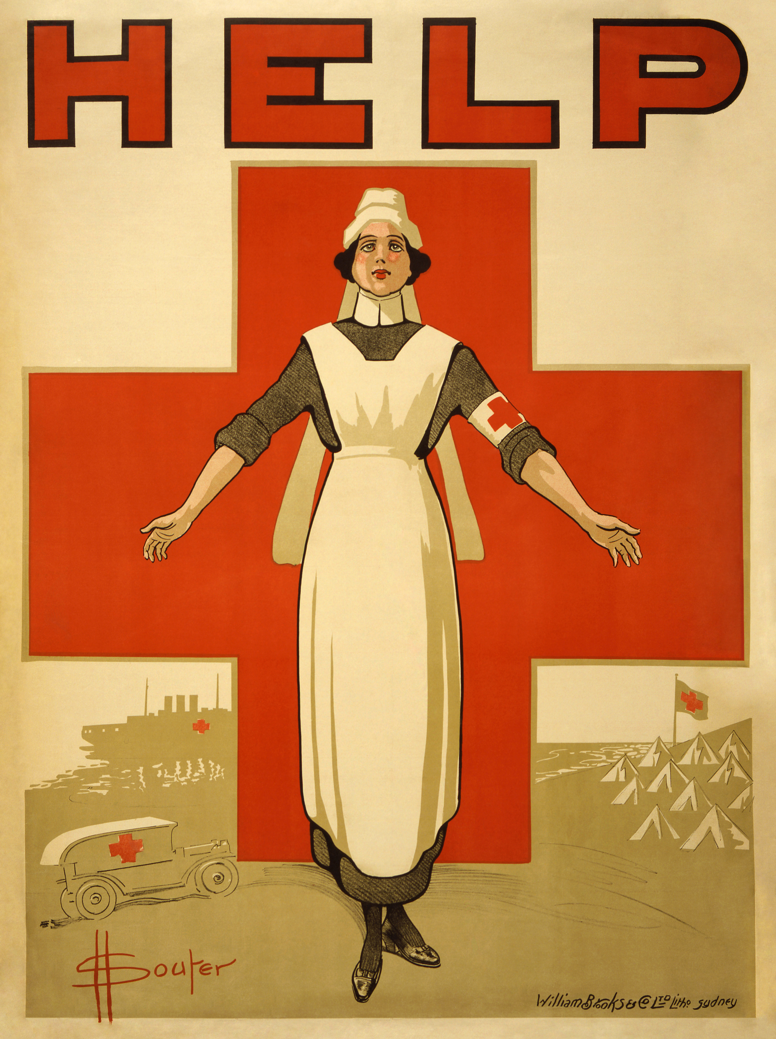 Australian copyright law is similar in that regard. So the image at left of a nurse, which is currently a featured picture candidate, is available at Commons for use at all projects. The artist David Henry Souter passed away in 1935 and the image entered public domain in 2005.
In order to make a historic image available globally through Wikimedia Commons hosting we have to determine what the local copyright duration is. That changes from country to country, but Commons doesn't yet have copyright summaries for every country. This is a major barrier to countering systemic bias.
So what's the status of that 1910 harbor panorama? Although it might seem so old that it must be public domain, that's really not guaranteed. The image of a nurse dates from World War I and only recently entered public domain in its country of origin. If that harbor happens to be in a country that observes life + 70 years as the standard term of copyright, and if the artist lived until 1947, then this image wouldn't be in the public domain yet. We have to understand these issues before we can upload.
It turns out the 1910 panorama was taken in Havana Harbor. Commons has copyright law summaries available in English for only three Latin American countries: Mexico, Argentina, and Brazil. In order to decipher this image's status I had to thread through Cuban copyright law. This one is public domain. I'd like to make a reference summary available for other Wikimedians who want to upload historical Cuban material, but I don't trust my Spanish enough for that important task. It's one thing to determine whether a particular image is public domain, another thing to summarize all relevant Cuban copyright law for the entire English speaking public. If your mastery of Spanish is better than mine, please help.
We need more people to translate copyright information for Wikimedia Commons. Right now Commons summaries are pretty good for North America and Europe, spotty for Asia, and seriously lacking for Africa and Latin America. When it comes to countering systemic bias, this is an issue that stops large numbers of people at the starting gate. So if you're fluent in Spanish, French, or any non-European language, please review the summary list at Commons:Licensing and see if your skills match the need. Online source references are available below.
*Collection of National Copyright Laws, UNESCO
*CERLALC copyright laws of Latin America
*ASEAN Southeast Asian copyright laws
Subscribe to:
Posts (Atom)

